Educator
Media Producer
About
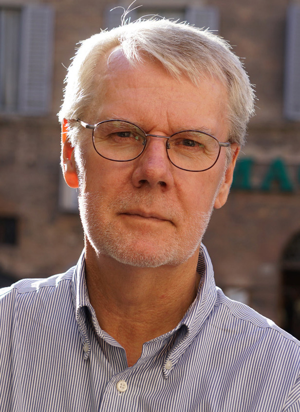
Dr. Anderson is a professor emeritus of interactive design in the School of Media Arts & Design at James Madison University where he was a Ruth D. Bridgeforth Endowed Professor. He is interested in interactive design, front-end web development, video journalism and study abroad, not necessarily in that order.
His websites have won the top awards from both the Association for Education in Journalism & Mass Communication - AEJMC (Best of the Web Competition) and the Broadcast Education Association - BEA (Best of Festival). This site was recognized with a Gold Award in the 2021 W3 Awards.
About this Site
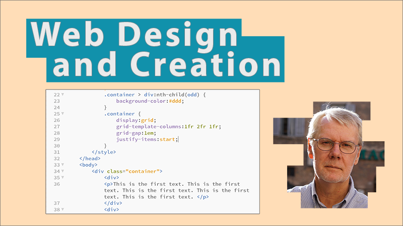
The site was hand-coded and uses no content management system nor framework. It uses a mobile-first, responsive approach with multiple media queries. The layout of the site was done with CSS Grid. In some cases, responsive layouts were achieved with CSS Grid's auto-fit and auto-fill keywords.
The site was created to teach students how to incorporate many of the features seen here. Please visit the Build My Portfolio section to see the lessons.
Light Mode/Dark Mode
This site supports the new CSS media feature known as prefers-color-scheme. While some websites have supported enabling a site-specific "dark mode" option manually, the new media feature allows users to change a preference within their OS. Once enabled, all sites that support the feature will appear in the mode selected without having to use a toggle switch on each individual site.
International Work

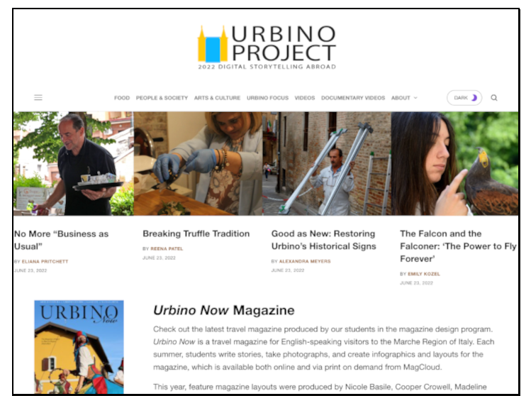
Urbino Project
Summer 2011 - Summer 2022. Directed a summer study abroad program where students produced multimedia, text, and video stories on places, people, and events in Urbino and the Marche region of Italy.

Florence Stories
Fall Semester 2017. JMU Faculty-Member-in-Residence. Taught a class called Florence Stories where students produced videos and blogged about a subject area or "beat" related to their majors.

Istanbul Stories
Summer 2015. Taught principles of video storytelling to students enrolled in the ieiMedia (Institute for Education in International Media) Istanbul program at Bahçeşehir University.

MISR International University
September 27 - October 12, 2012. Visiting Professor. Taught a course in online communication and wrote a report with recommendations on their communication curricula.

Semester in London
Fall Semester 2009. Worked with students in the JMU Semester in London program located in the Bloomsbury neighborhood of London. Led tours and cultural events.
Websites
Latest Projects
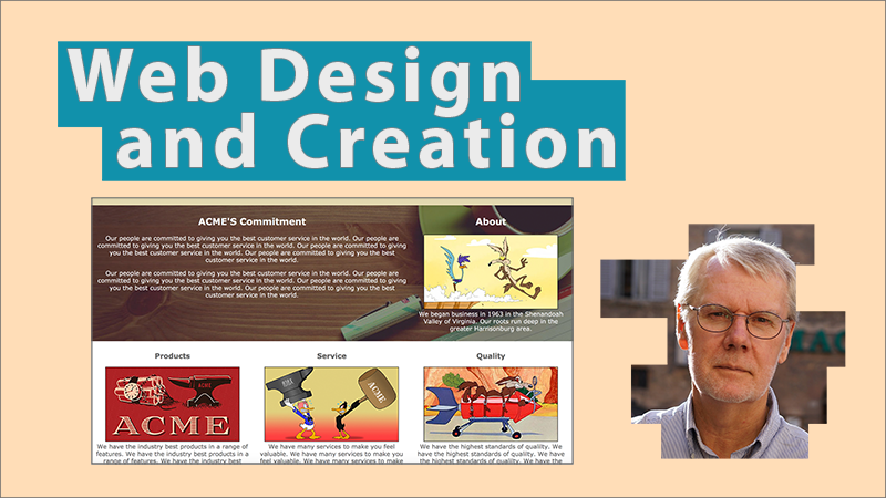
These are two of the most recent web projects I've been working on. The "CSS Grid Layout" site was completely hand-coded using the latest CSS layout module called CSS Grid. No frameworks or libraries were used.
The "Urbino Project" was created using the WordPress (.org, not .com) content management system. It's one of ten separate sites made for the Urbino Project going back to 2011.
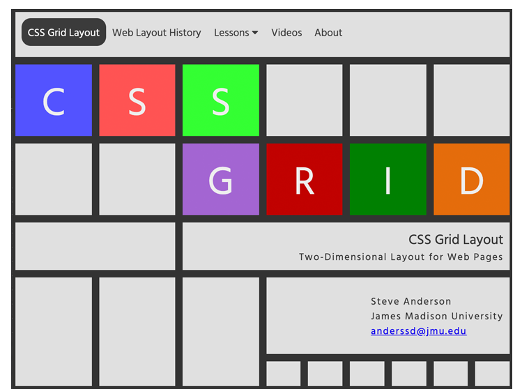
CSS Grid Layout
Website created as a tutorial for learning the CSS Grid Layout Module.
grid-layout.com
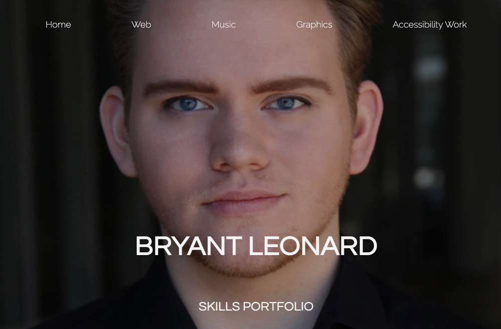
Student Work
Below are some of the best porfolio sites created by my students. All are mobile-first, responsive sites utilizing CSS Grid for layout. Students used various techniques found at the Build this Portfolio site.
Used by permission.


Instructional Videos
Latest Videos
These are four videos I created to teach the use of CSS Grid for layout of webpages. The material covers CSS Grid from the basics to more advanced applications.
CSS Grid Basics
This video covers the basics of CSS grid, including grid's properties, a new unit called the "fractional unit" (fr), grid lines, grid areas, nested grids, justification and alignment, overlapping, and making white space.
Watch: MP4 | YouTube

Auto-Fit and Auto-Fill: Responsive Sites without Media Queries
This video lesson contains an overview of CSS Grid's auto-fit and auto-fill keywords and how they are used to make a responsive page without media queries.
Watch: MP4 | YouTube

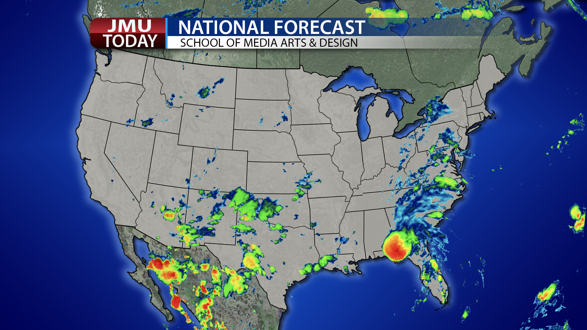
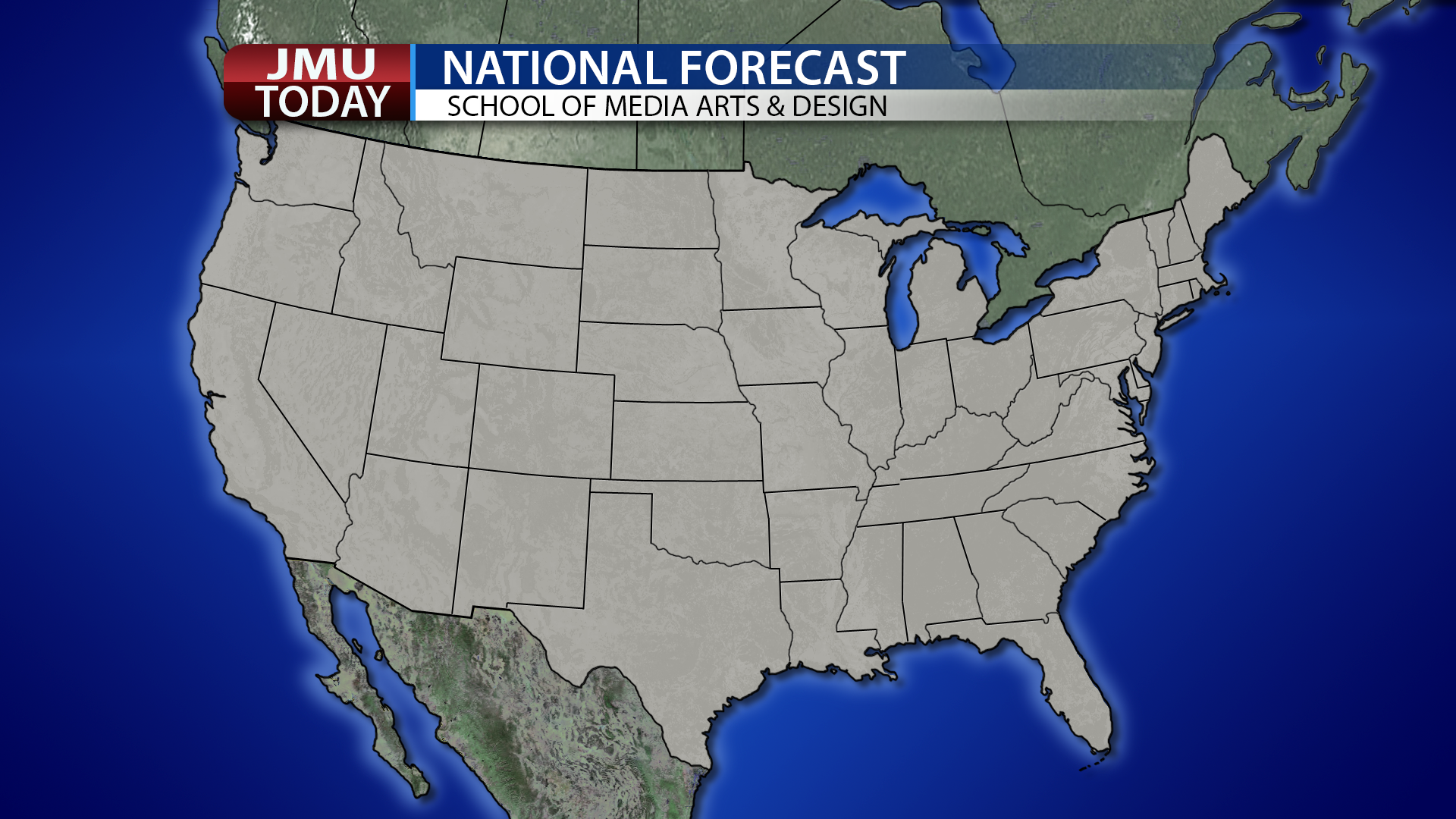
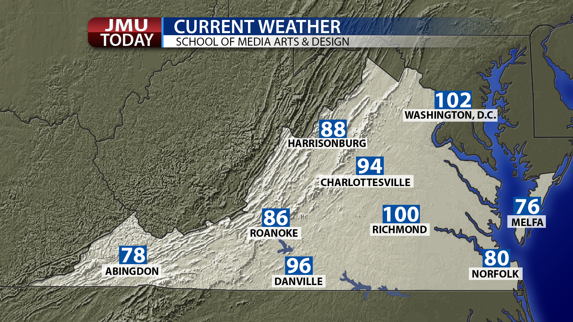
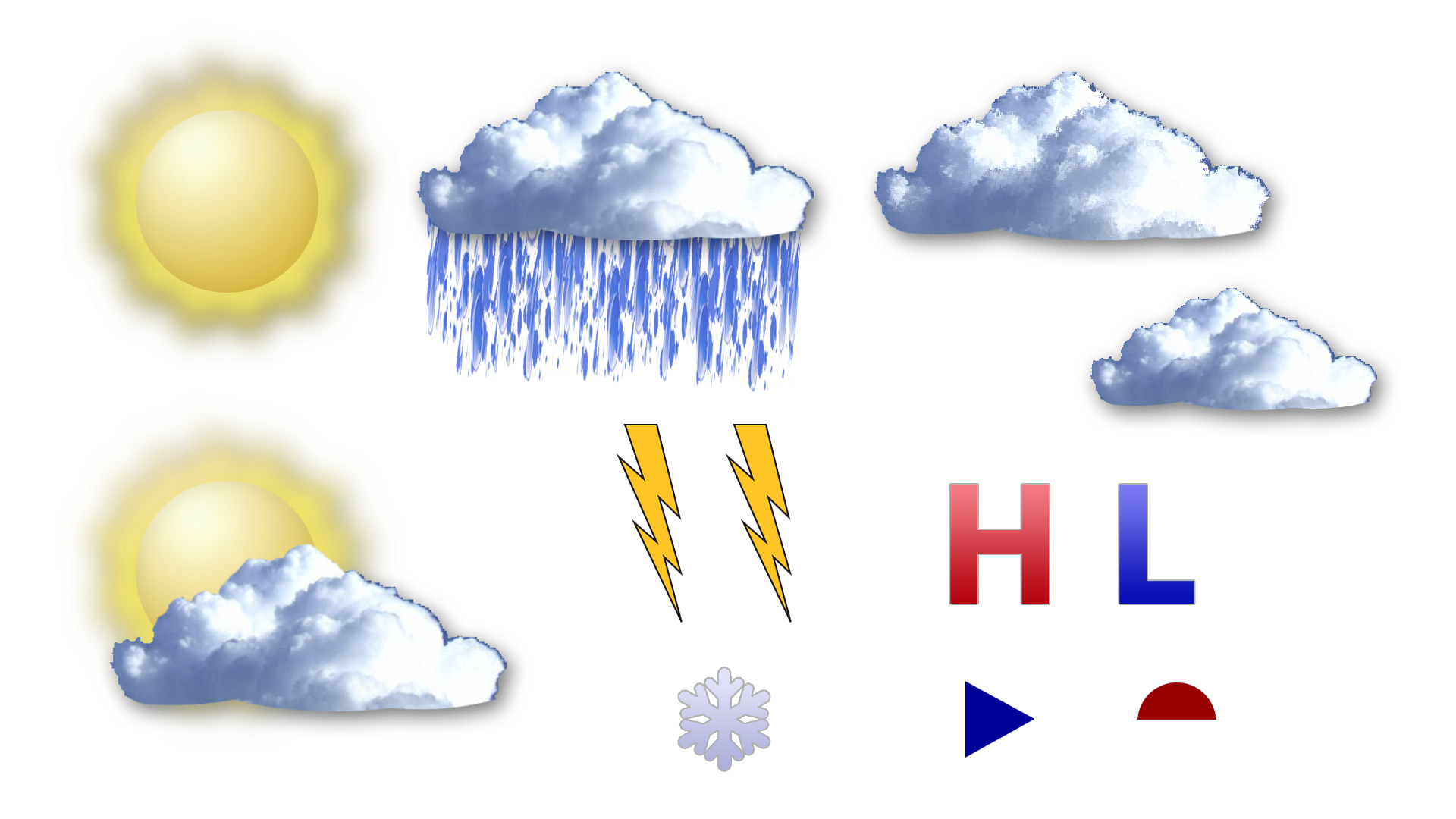
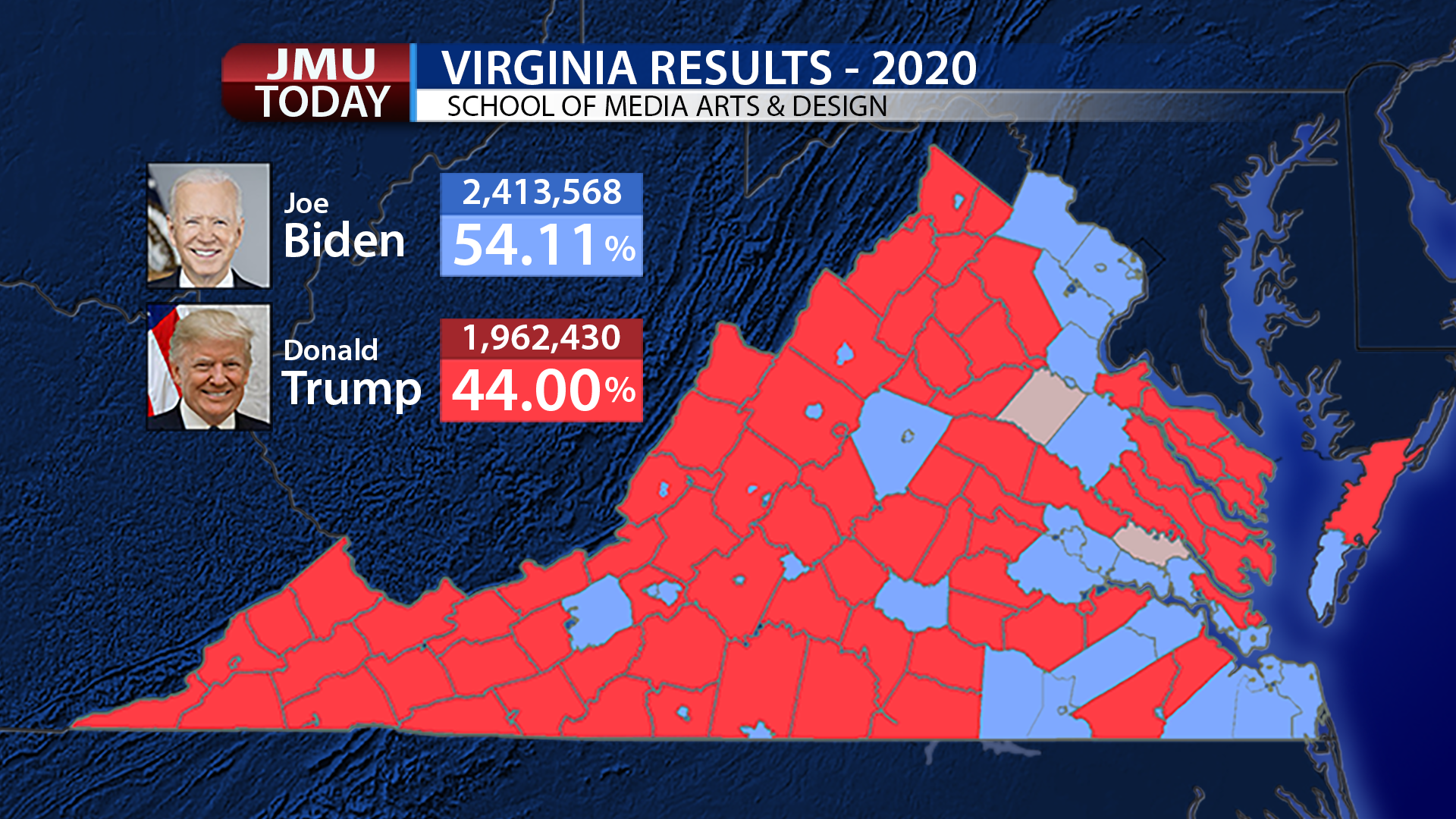
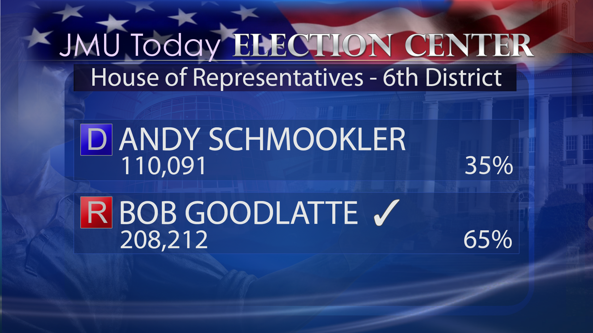
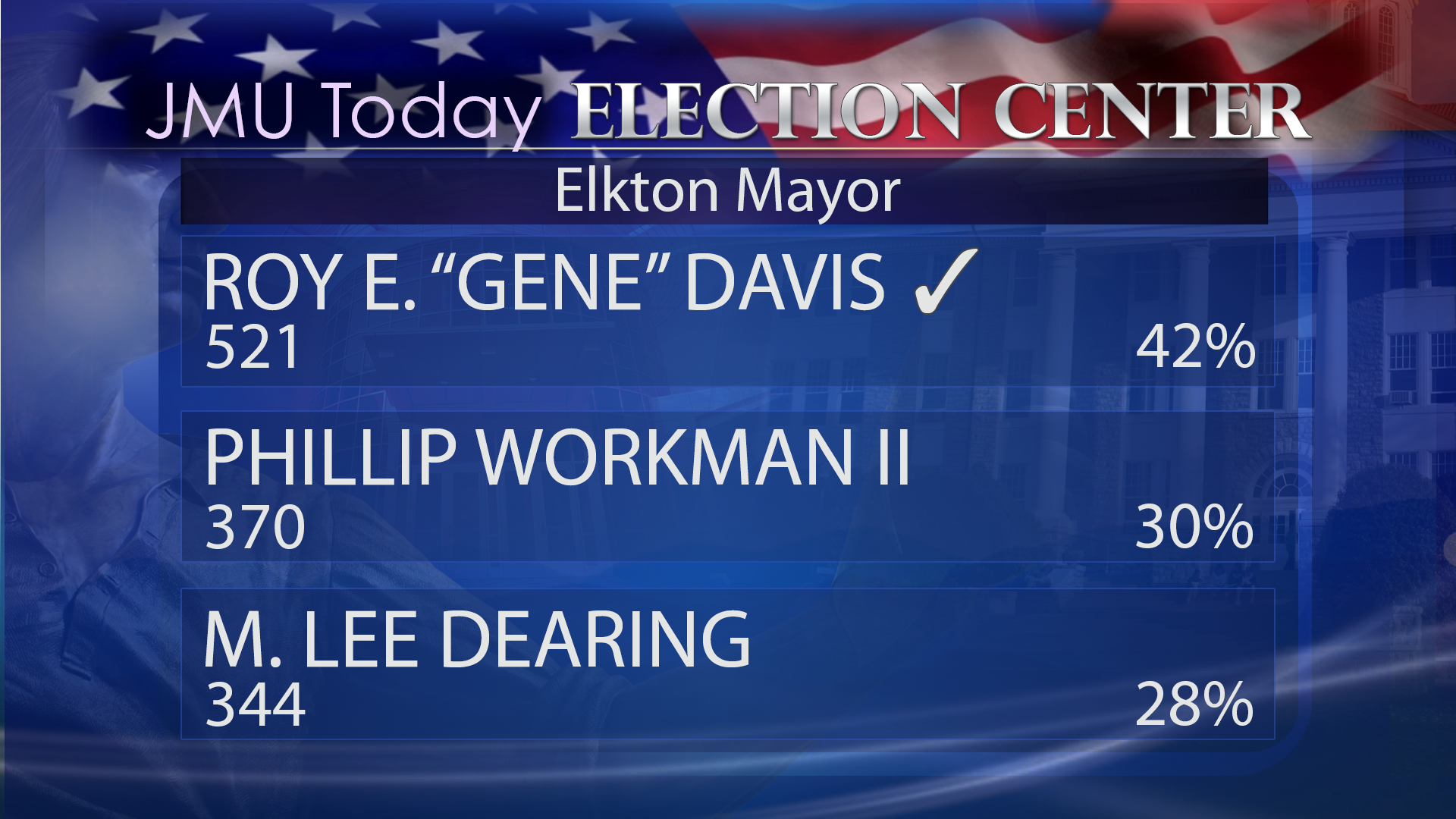
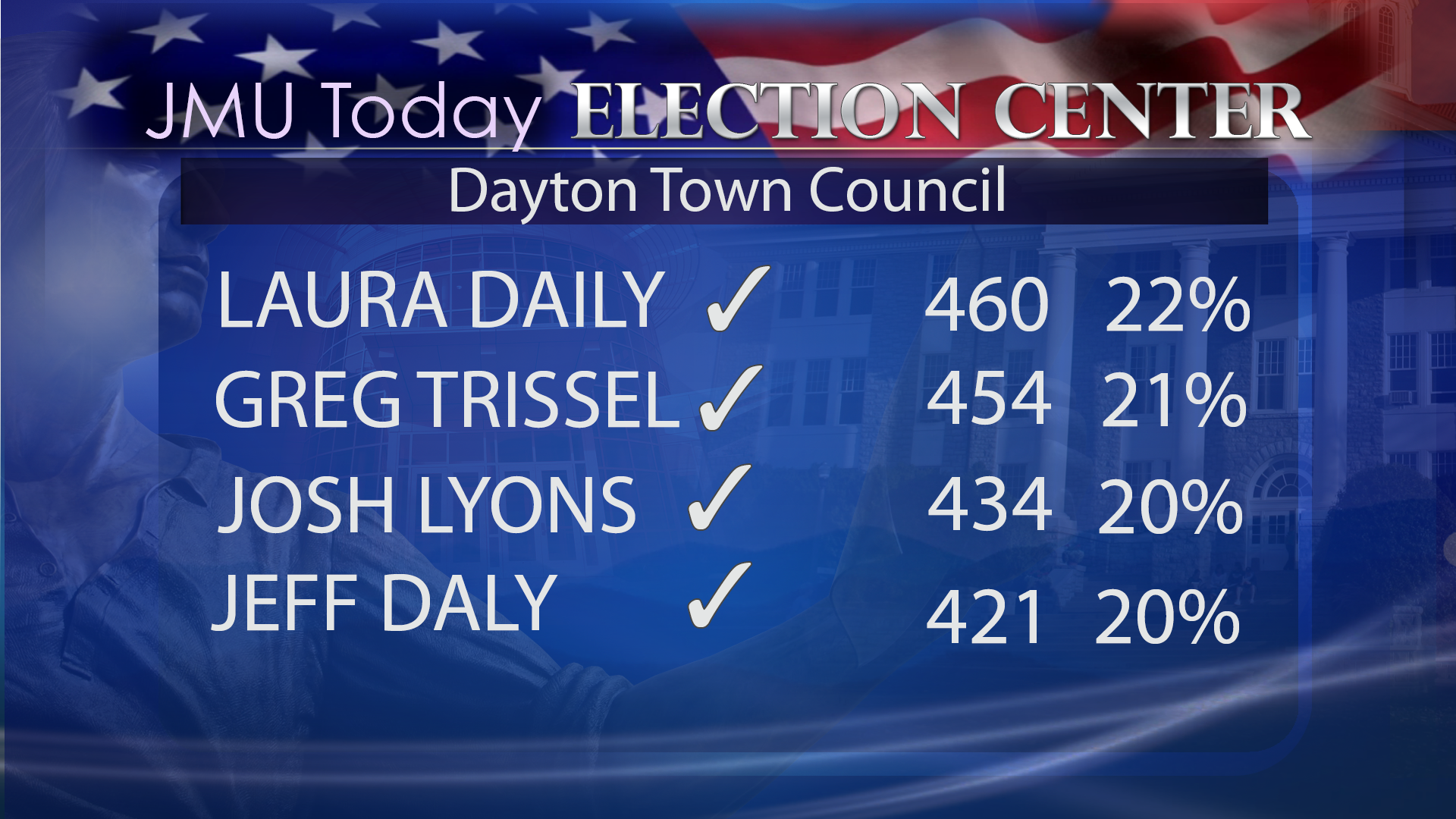
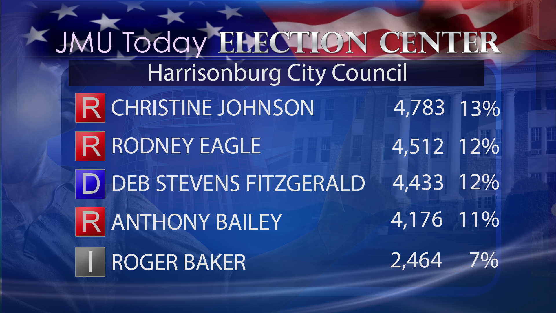
TV News/Weather Graphics
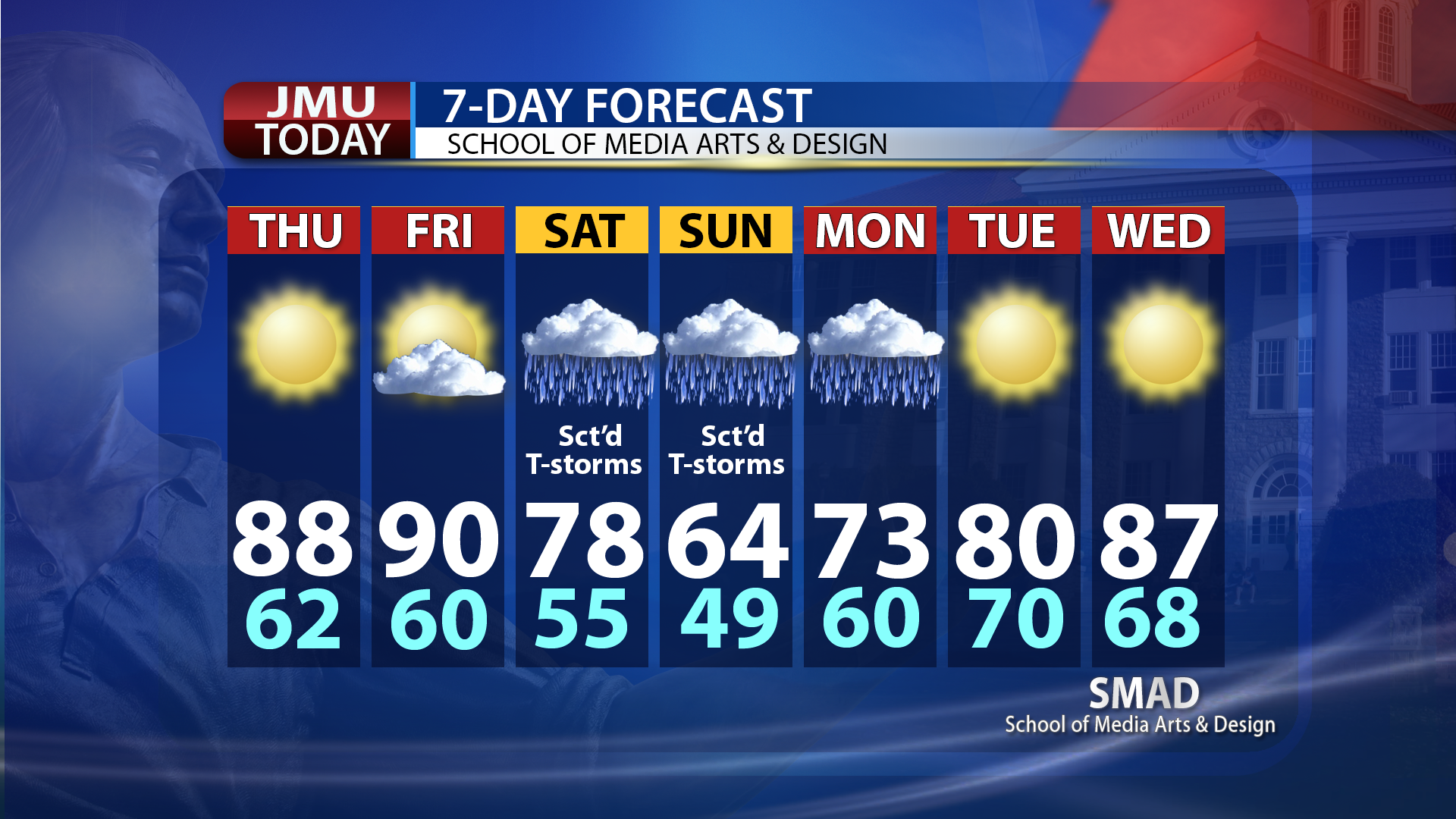
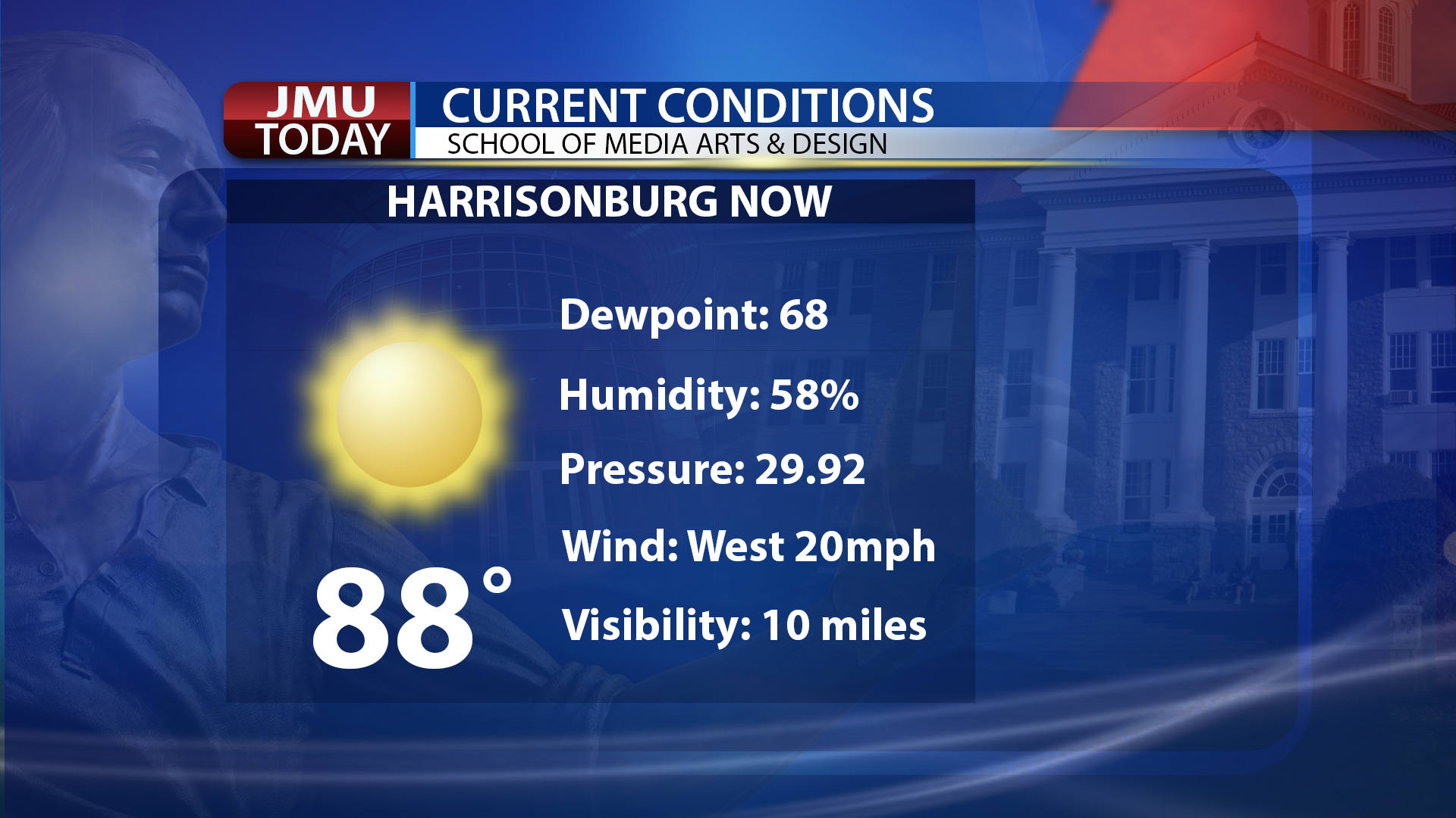
The images below represent work done for SMAD's weekly student-run television newscast, "JMU Today". While broadcast stations tend to use specialized, proprietary systems for creating news and weather graphics, these were created in Adobe Photoshop.
The images below show sample completed graphics, but the editable multi-layered Photoshop (PSD) base graphics are accessible as well.

Television News Videos
In my first career, I was a television weathercaster, environmental reporter, and news videographer. I worked at three stations, KTHI (now KVLY) in Fargo, N.D., KJEO (now KGPE) in Fresno, California, and KCNC in Denver, Colorado. I spent 7 1/2 years at KCNC (network owned and operated station) as a weathercaster and environmental specialist reporter.
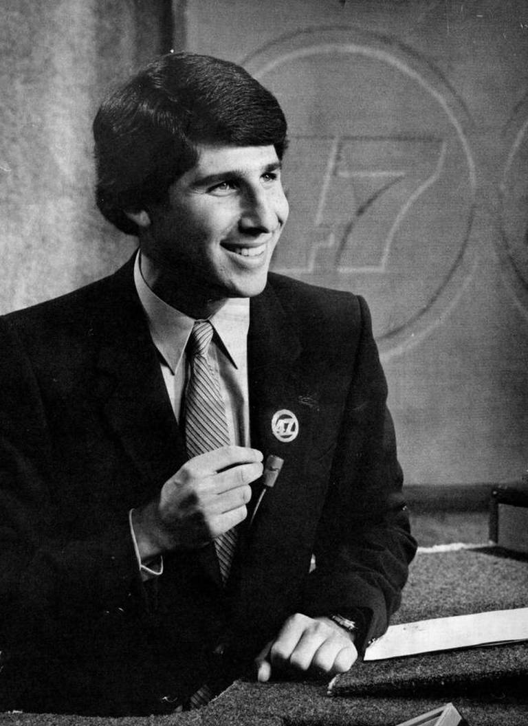 Note: I had the good fortune of working on-air with Peter Rogot in both Fresno and Denver. He is seen in many of these videos. Peter died in 1991 at age 37 from a congenital heart defect while working at ESPN. More here, here, here, and here.
MP4 Video Playlist
(Best Quality)
KCNC/KOA-TV DENVER
Me Portrayed on South Park?
KCNC Final Day on Air (August 4, 1989)
KCNC News Open #1
KCNC News Open #2 (1986)
KCNC News Open #3
KCNC News Open #4
KCNC News Open #5 (1984)
KCNC Weathercast. Need Rain
KCNC Weathercast (7/21/89)
KCNC Weathercast (7/18/89)
KCNC Weathercast (7/13/89)
KCNC Weathercast (12/30/88)
KCNC Weather Update - Mentions Intern (11/12/88)
KCNC Weathercast (10/23/88)
KCNC Weathercast (10/22/88)
KCNC Weathercast (10/9/88)
KCNC Weathercast (10/8/88)
KCNC Weather & Hurricane Gilbert (9/15/88)
KCNC Weather Live from Taste of Colorado (9/3/88)
KCNC Weather & Weather Update (7/10/88)
KCNC Weather & Weather Update (6/19/88)
KCNC Weathercast (4/9/88)
KCNC Weathercast (3/11/88)
KCNC Weathercast (2/20/88)
KCNC Weathercast (2/14/88)
KCNC Weathercast (5/17/87)
KCNC Weather Update (9/21/86)
KCNC Weather Segments - Tornadic Day (6/8/86)
KCNC Weathercast (10/27/85)
KCNC Weather Newscast Snippets (10/13/85)
KCNC Weathercast (10/13/85)
KCNC Weather: 6AM Open & Super Tease (8/29/85)
KCNC Weathercast (8/25/85)
KCNC Weathercast (8/24/85)
KCNC Weathercast (7/20/85)
KCNC Weathercast & Update (6/9/85)
KCNC Weathercast (4/14/85)
KCNC Weathercast (11/28/84)
KCNC Weathercast (8/26/84)
KCNC Weathercast (7/1/84)
KCNC Weathercast (6/3/84)
KCNC Weathercast (4/21/84)
KCNC Weather. "Jet Stream Explanation" (4/8/84)
KCNC Weathercast (4/1/84)
KCNC Weathercast (3/25/84)
KCNC Weathercast (2/18/84)
KCNC Weathercast (7/23/83)
KCNC/KOA Weathercast - Vacation Beard (5/7/83)
KCNC/KOA Weathercast - Vernal Equinox (3/20/83)
KCNC/KOA Weathercast - First with Weather Computer (3/13/83)
KCNC/KOA Weathercast (3/7/83)
KCNC/KOA Weathercast (1/19/83)
KCNC/KOA Weathercast (12/25/82)
KCNC/KOA Weathercast (12/12/82)
KCNC/KOA Weathercast - 2nd Part (11/7/82)
KCNC/KOA Weathercast (8/10/82)
KCNC/KOA Weathercast (7/5/82)
KCNC/KOA Weathercast & Matt Birth (6/5/82)
KCNC/KOA Weathercast (5/30/82)
KCNC/KOA Weathercast (5/29/82)
KCNC/KOA Weathercast (2/20/82)
KCNC "This is Colorado" Promo (1988)
KCNC Weather Promo. Teamwork
KCNC Noon News Quiz (8/10/84)
KCNC "Igor the Talking Weather Computer" Promo
KCNC Super Tease
KCNC Weather Tease (1984)
KCNC Super Tease (4/14/84)
KCNC/KOA Super Tease (3/7/83)
KCNC Storm Center 4 Reporting #1 (5/15/89)
KCNC Storm Center 4 Reporting #2 (1/29/89)
KCNC Live Shot. Thanksgiving Travel (11/22/84)
KCNC Weather Snippet. "Autumnal Equinox" (9/22/84)
KCNC Weather Snippet. "Broncos Weather" (9/22/84)
KCNC Reporting. "Solar Eclipse" (3/6/89)
KCNC Reporting. "Nuclear Winter" (9/9/88)
KCNC Picnic - Elitch Gardens (July 88)
KCNC Reporting. "Forest Fires" (7/28/88)
KCNC Reporting. "Tornado Season" (6/9/88)
KCNC Reporting. "Winter Recap" (2/29/88)
KCNC Reporting. "Storm History" (2/28/88)
KCNC Reporting. "Daylight Saving/Pollution" (12/25/87)
KCNC Reporting. "Storm Chasers" (6/28/87)
KCNC Reporting. "Tornado Trackdown" Promo & Story (5/13/87)
KCNC Reporting. "Avalanche Anatomy" (2/19/87)
KCNC Reporting. "Pollution Sanctions" (12/1/86)
KCNC Reporting. "NWS of the Future" (11/7/86)
KCNC Reporting. "Igor" (10/17/86)
KCNC Promo & Story. "Woodburning Ban" (9/26/86)
KCNC Reporting. "Water Conservation - Xeriscape" (5/30/86)
KCNC Reporting. "Water Conservation - ET Rate" (5/29/86)
KCNC Reporting. "Severe Summer Weather" (5/9/86)
KCNC Reporting. "Radiation - Chernobyl" (5/7/86)
KCNC Reporting. "Daylight Saving & Pollution" (4/25/86)
KCNC Reporting. "Auto Emissions Bill" (4/21/86)
KCNC Reporting. "Igor the Talking Weather Computer" (4/1/86)
KCNC Reporting. "Better Air Campaign - Kickoff" (11/14/85)
KCNC Reporting. "Better Air Campaign - Business" (11/6/85)
KCNC Reporting. "Halley's Comet" (10/14/85)
KCNC Reporting. "E.T. Program" (10/2/85)
KCNC Reporting. "Wind Shear" (8/4/85)
KCNC Reporting. "Camping Weather" (7/2/85)
KCNC Stand-Up at Home. (5/31/85)
KCNC Reporting. "Water Rationing" (5/20/85)
KCNC Reporting. "Year 2000: The Air We Breathe" (2/19/85)
KCNC Reporting. "Better Air" (1/14/85)
KCNC Anchoring. "Sports & People" 6AM (1984: 12/26, 12/27, 12/28. 1985: 1/4)
KCNC Reporting. "Better Air Campaign" (11/16/84)
KCNC Reporting. "Better Air Campaign" (11/15/84)
KCNC Reporting. "Winter Forecast" (10/22/84)
KCNC Reporting. "Better Air Campaign Kickoff" (10/11/84)
KCNC Reporting. "Cloud Seeding" (9/14/84)
KCNC Reporting. "Cold Weather Stats" (12/21/83)
KCNC Reporting. "Forecast Explanation" (11/29/83)
KCNC Reporting. "Denver Bad Air" (11/17/83)
KCNC Reporting. "Greenhouse Effect" (10/30/83)
KCNC Reporting. "Water Restrictions" (9/30/83)
KCNC Reporting. "Coming Winter" (9/18/83)
KCNC/KOA Reporting. "Lightning Danger" (7/11/83)
KCNC/KOA Reporting. "Coming Snow" (3/2/83)
KCNC/KOA Reporting. "Icy Weather" (12/7/82)
KCNC/KOA Reporting 10PM. "Rocky Mountain Arsenal" (12/6/82)
KCNC/KOA 5PM Live Shot. "Rocky Mountain Arsenal" (12/6/82)
KCNC/KOA Reporting. "Emissions Testing" (11/24/82)
KCNC/KOA Reporting. "Chinook Winds" (11/17/82)
KCNC/KOA Reporting. "Air Pollution" (11/12/82)
KCNC/KOA Reporting. "Thunderstorm Alley" (10/6/82)
KCNC/KOA Reporting. "Early Snow Live Shot & Story" (9/13/82)
KCNC/KOA Reporting. "Winter Forecast" (8/30/82)
KCNC/KOA Reporting. "Auto Smog - Going Mobile" (8/18/82)
KCNC/KOA Reporting. "Lunar Eclipse" (7/5/82)
KCNC/KOA Reporting. "Thunderstorm Study Plane" (6/5/82)
KCNC/KOA Reporting. "Last Chance/Lowry" (5/24/82)
KCNC/KOA Reporting. "Ozone Pollution" (5/17/82)
KCNC/KOA Reporting. "Tornadoes" (5/11/82)
KCNC/KOA Reporting. "Denver Water Supply" (3/31/82)
KCNC/KOA Reporting. "Storm Study" (3/30/82)
KCNC/KOA Reporting. "Solar Home" (2/22/82)
KCNC/KOA Reporting. "Diesel Pollution" (2/16/82)
KCNC/KOA Reporting. "AIR Program Survey" (2/15/82)
KCNC Reporting. "High Pollution Day"
KCNC Promo. "Colorado Weather Guide" (1987)
KCNC Weather Promo (1987)
KCNC Weather Watchers Seminar (7/13/85)
KCNC Weather Watchers Seminar (4/14/84)
U. of Denver Graduation & Weathercast (6/8/85)
KCNC Super Tease - Mistakes (2/3/85)
KCNC Weather Watcher Promo
KCNC Holiday Promo (1984)
KCNC Production Crew
KOA/KCNC Sam Allred (3/24/83)
KOA/KCNC Frank Masseli Promo (1970s?)
KCNC Brian Maass' "How Friendly Story" (With Al Goldberg)
KCNC John Nickel's "Boot Story"
KCNC WeatherWatcher - Mabel Kirby
KCNC Holiday Party (12/10/88)
Birth of Kyle (10/25/88)
KJEO-TV FRESNO
KJEO Fresno News Open (Feb. 1983)
KJEO Weathercast (12/4/81)
KJEO Weathercast (11/11/81)
KJEO Weathercast (10/29/81)
KJEO Weathercast (10/13/81)
KJEO Weathercast (10/12/81)
KJEO Weathercast (9/30/81)
KJEO Weathercast (9/23/81)
KJEO Weathercast (9/11/81)
KJEO Weathercast (9/9/81)
KJEO Weathercast (1981)
KJEO Weathercast (5/29/81)
KJEO Weathercast (4/28/81)
KJEO Weathercast "New Set" (1/28/81)
KJEO Weathercast (1/23/81)
KJEO Weathercast (1/13/81)
KJEO Weathercast (1/8/81)
KJEO Weathercast (12/30/80)
KJEO Weathercast (12/17/80)
KJEO Weathercast (12/12/80)
KJEO Weathercast (12/11/80)
KJEO Weathercast (11/13/80)
KJEO Weathercast (10/6/80)
KJEO Weathercast (9/29/80)
KJEO Weathercast (8/27/80)
KJEO Weathercast (7/18/80)
KJEO Weathercast (3/14/80)
KJEO Weathercast (2/14/80)
KJEO Weathercast (1/14/80)
KJEO Weathercast (11/20/79)
KJEO Weathercast (9/19/79)
KJEO Weathercast (9/18/79)
KJEO Fresno Weathercast
KJEO Reporting "Air Quality" (Dec. 1981)
KJEO News Photography "Riverdale vs. Memorial Basketball" (12/30/81)
KJEO News Photography "Baseball - Fresno Giants vs. San Jose Missions" (6/9/81)
KJEO News Photography "Boxing - Main Camera" (6/9/81)
KJEO News Photography "Instant Garden - Marc Cotta" (2/24/81)
KJEO News Photography "Former Iranian Hostage Steve Lauterbach" (2/18/81)
KJEO News Photography "Cloud Video" (1/23/81)
KJEO Reporting "Gould Canal" (7/11/80)
KJEO News Photography "Iranian Protest" (4/17/80)
KJEO News Photography "Golf" (4/3/80)
KJEO Reporting "Rain Gauge" (1/16/80)
KJEO News Photography "LeMoore Commander" (Feb./Mar. 1980)
KJEO News Photography "Bread Cost" (12/4/79)
KJEO News Photography "Unwed Mothers" (11/28/79)
KJEO News Photography "Off Road Display" (10/21/79)
KJEO News Photography "McDonalds Tennis" (7/14/79)
KJEO Fresno Weather Promo
KJEO Fresno "Chili Cookoff Judging" (4/19/80)
KTHI-TV FARGO
KTHI Fargo Weathercast (1/5/79)
KTHI Fargo Weathercast (10/17/78)
KTHI Fargo Anchoring (10/15/78)
KTHI Fargo Hosting ("Midday" Show)
KTHI Fargo Videography. "Trucker Strike #1" (6/7/79)
KTHI Fargo Videography. "Trucker Strike #2" (6/3/79)
KTHI Fargo Videography. "Flooding" (4/19 & 4/21 1979)
KTHI Fargo Videography. "Play" (Feb. 1979)
KTHI Fargo Videography. "Eclipse" (2/21/79)
KTHI Fargo Videography. "Hector Airport" (1978)
KTHI Fargo Promo. "Weather" (1978)
KTHI Fargo Promo. "Basketball" (1978)
KTHI Fargo Audition. (Mid-March 1978)
WSLS-TV ROANOKE - FILL-IN
WSLS Weathercasts (8/21/93)
WSLS Weathercasts (8/15/93)
WSLS Weathercasts (1/24/93)
WSLS Weathercasts (1/17/93)
WSLS Weathercasts (1/16/93)
WSLS Weathercasts (1/11/93)
WSLS Weathercasts (1/10/93)
WSLS Weathercasts (1/9/93)
WSLS Weathercasts (1/3/93)
WSLS Weathercasts (1/2/93)
MARY ELLEN - REPORTING
KTHI Mary Ellen Reporting. "Memorial Day" (5/28/79)
KTHI Mary Ellen Reporting. "Nuclear Power - Part 1" (1979)
KTHI Mary Ellen Reporting. "Nuclear Power - Part 2" (1979)
KTHI Mary Ellen Reporting. "Nuclear Power - Part 3" (1979)
KTHI Mary Ellen Reporting. "Nuclear Power - Part 4" (1979)
KTHI Mary Ellen Reporting. "Nuclear Power - Part 5" (1979)
KTHI Mary Ellen Reporting. "Bats" (1/22/79)
KTHI Mary Ellen Reporting. "Bats" (Short Version - 1/22/79)
KTHI Mary Ellen Reporting. "Medicare" (1978)
KBJR Duluth. Mary Ellen Reporting. "May Day" (1978 Internship)
KBJR Duluth. Mary Ellen Reporting. "Bridge" (1978 Internship)
KBJR Duluth. Mary Ellen Reporting. "Wacky Olympics" (1978 Internship)
KBJR Duluth. Mary Ellen Reporting. "Tamburitzans" (1978 Internship)
MISC.
WTCN Minneapolis. Steve Production. "Castle Royal" (Winter 1978 Internship)
KMOR St. Cloud State U. News Open (1977?)
YouTube Playlist
(Lower Quality)
KCNC/KOA-TV DENVER
Me Portrayed on South Park?
KCNC Final Day on Air (August 4, 1989)
KCNC News Open #1
KCNC News Open #2 (1986)
KCNC News Open #3
KCNC News Open #4
KCNC News Open #5 (1984)
KCNC Weathercast. Need Rain
KCNC Weathercast (7/21/89)
KCNC Weathercast (7/18/89)
KCNC Weathercast (7/13/89)
KCNC Weathercast (12/30/88)
KCNC Weather Update - Mentions Intern (11/12/88)
KCNC Weathercast (10/23/88)
KCNC Weathercast (10/22/88)
KCNC Weathercast (10/9/88)
KCNC Weathercast (10/8/88)
KCNC Weather & Hurricane Gilbert (9/15/88)
KCNC Weather Live from Taste of Colorado (9/3/88)
KCNC Weather & Weather Update (7/10/88)
KCNC Weather & Weather Update (6/19/88)
KCNC Weathercast (4/9/88)
KCNC Weathercast (3/11/88)
KCNC Weathercast (2/20/88)
KCNC Weathercast (2/14/88)
KCNC Weathercast (5/17/87)
KCNC Weather Update (9/21/86)
KCNC Weather Segments - Tornadic Day (6/8/86)
KCNC Weathercast (10/27/85)
KCNC Weather Newscast Snippets (10/13/85)
KCNC Weathercast (10/13/85)
KCNC Weather: 6AM Open & Super Tease (8/29/85)
KCNC Weathercast (8/25/85)
KCNC Weathercast (8/24/85)
KCNC Weathercast (7/20/85)
KCNC Weathercast & Update (6/9/85)
KCNC Weathercast (4/14/85)
KCNC Weathercast (11/28/84)
KCNC Weathercast (8/26/84)
KCNC Weathercast (7/1/84)
KCNC Weathercast (6/3/84)
KCNC Weathercast (4/21/84)
KCNC Weather. "Jet Stream Explanation" (4/8/84)
KCNC Weathercast (4/1/84)
KCNC Weathercast (3/25/84)
KCNC Weathercast (2/18/84)
KCNC Weathercast (7/23/83)
KCNC/KOA Weathercast - Vacation Beard (5/7/83)
KCNC/KOA Weathercast - Vernal Equinox (3/20/83)
KCNC/KOA Weathercast - First with Weather Computer (3/13/83)
KCNC/KOA Weathercast (3/7/83)
KCNC/KOA Weathercast (1/19/83)
KCNC/KOA Weathercast (12/25/82)
KCNC/KOA Weathercast (12/12/82)
KCNC/KOA Weathercast - 2nd Part (11/7/82)
KCNC/KOA Weathercast (8/10/82)
KCNC/KOA Weathercast (7/5/82)
KCNC/KOA Weathercast & Matt Birth (6/5/82)
KCNC/KOA Weathercast (5/30/82)
KCNC/KOA Weathercast (5/29/82)
KCNC/KOA Weathercast (2/20/82)
"This is Colorado" Promo (1988)
KCNC Weather Promo. Teamwork
KCNC Noon News Quiz (8/10/84)
KCNC "Igor the Talking Weather Computer" Promo
KCNC Super Tease
KCNC Weather Tease (1984)
KCNC Super Tease (4/14/84)
KCNC/KOA Super Tease (3/7/83)
KCNC Storm Center 4 Reporting #1 (5/15/89)
KCNC Storm Center 4 Reporting #2 (1/29/89)
KCNC Live Shot. Thanksgiving Travel (11/22/84)
KCNC Weather Snippet. "Autumnal Equinox" (9/22/84)
KCNC Weather Snippet. "Broncos Weather" (9/22/84)
KCNC Reporting. "Solar Eclipse" (3/6/89)
KCNC Reporting. "Nuclear Winter" (9/9/88)
KCNC Picnic - Elitch Gardens (July 88)
KCNC Reporting. "Forest Fires" (7/28/88)
KCNC Reporting. "Tornado Season" (6/9/88)
KCNC Reporting. "Winter Recap" (2/29/88)
KCNC Reporting. "Storm History" (2/28/88)
KCNC Reporting. "Daylight Saving/Pollution" (12/25/87)
KCNC Reporting. "Storm Chasers" (6/28/87)
KCNC Reporting. "Tornado Trackdown" Promo & Story (5/13/87)
KCNC Reporting. "Avalanche Anatomy" (2/19/87)
KCNC Reporting. "Pollution Sanctions" (12/1/86)
KCNC Reporting. "NWS of the Future" (11/7/86)
KCNC Reporting. "Igor" (10/17/86)
KCNC Promo & Story. "Woodburning Ban" (9/26/86)
KCNC Reporting. "Water Conservation - Xeriscape" (5/30/86)
KCNC Reporting. "Water Conservation - ET Rate" (5/29/86)
KCNC Reporting. "Severe Summer Weather" (5/9/86)
KCNC Reporting. "Radiation - Chernobyl" (5/7/86)
KCNC Reporting. "Daylight Saving & Pollution" (4/25/86)
KCNC Reporting. "Auto Emissions Bill" (4/21/86)
KCNC Reporting. "Igor the Talking Weather Computer" (4/1/86)
KCNC Reporting. "Better Air Campaign - Kickoff" (11/14/85)
KCNC Reporting. "Better Air Campaign - Business" (11/6/85)
KCNC Reporting. "Halley's Comet" (10/14/85)
KCNC Reporting. "E.T. Program" (10/2/85)
KCNC Reporting. "Wind Shear" (8/4/85)
KCNC Reporting. "Camping Weather" (7/2/85)
KCNC Stand-Up at Home. (5/31/85)
KCNC Reporting. "Water Rationing" (5/20/85)
KCNC Reporting. "Year 2000: The Air We Breathe" (2/19/85)
KCNC Reporting. "Better Air" (1/14/85)
KCNC Anchoring. "Sports & People" 6AM (1984: 12/26, 12/27, 12/28. 1985: 1/4)
KCNC Reporting. "Better Air Campaign" (11/16/84)
KCNC Reporting. "Better Air Campaign" (11/15/84)
KCNC Reporting. "Winter Forecast" (10/22/84)
KCNC Reporting. "Better Air Campaign Kickoff" (10/11/84)
KCNC Reporting. "Cloud Seeding" (9/14/84)
KCNC Reporting. "Cold Weather Stats" (12/21/83)
KCNC Reporting. "Forecast Explanation" (11/29/83)
KCNC Reporting. "Denver Bad Air" (11/17/83)
KCNC Reporting. "Greenhouse Effect" (10/30/83)
KCNC Reporting. "Water Restrictions" (9/30/83)
KCNC Reporting. "Coming Winter" (9/18/83)
KCNC/KOA Reporting. "Lightning Danger" (7/11/83)
KCNC/KOA Reporting. "Coming Snow" (3/2/83)
KCNC/KOA Reporting. "Icy Weather" (12/7/82)
KCNC/KOA Reporting 10PM. "Rocky Mountain Arsenal" (12/6/82)
KCNC/KOA 5PM Live Shot. "Rocky Mountain Arsenal" (12/6/82)
KCNC/KOA Reporting. "Emissions Testing" (11/24/82)
KCNC/KOA Reporting. "Chinook Winds" (11/17/82)
KCNC/KOA Reporting. "Air Pollution" (11/12/82)
KCNC/KOA Reporting. "Thunderstorm Alley" (10/6/82)
KCNC/KOA Reporting. "Early Snow Live Shot & Story" (9/13/82)
KCNC/KOA Reporting. "Winter Forecast" (8/30/82)
KCNC/KOA Reporting. "Auto Smog - Going Mobile" (8/18/82)
KCNC/KOA Reporting. "Lunar Eclipse" (7/5/82)
KCNC/KOA Reporting. "Thunderstorm Study Plane" (6/5/82)
KCNC/KOA Reporting. "Last Chance/Lowry" (5/24/82)
KCNC/KOA Reporting. "Ozone Pollution" (5/17/82)
KCNC/KOA Reporting. "Tornadoes" (5/11/82)
KCNC/KOA Reporting. "Denver Water Supply" (3/31/82)
KCNC/KOA Reporting. "Storm Study" (3/30/82)
KCNC/KOA Reporting. "Solar Home" (2/22/82)
KCNC/KOA Reporting. "Diesel Pollution" (2/16/82)
KCNC/KOA Reporting. "AIR Program Survey" (2/15/82)
KCNC Reporting. "High Pollution Day"
KCNC Promo. "Colorado Weather Guide" (1987)
KCNC Weather Promo (1987)
KCNC Weather Watchers Seminar (7/13/85)
KCNC Weather Watchers Seminar (4/14/84)
U. of Denver Graduation & Weathercast (6/8/85)
KCNC Super Tease - Mistakes (2/3/85)
KCNC Weather Watcher Promo
KCNC Holiday Promo (1984)
KCNC Production Crew
KOA/KCNC Sam Allred (3/24/83)
KOA/KCNC Frank Masseli Promo (1970s?)
KCNC Brian Maass' "How Friendly Story" (With Al Goldberg)
KCNC John Nickel's "Boot Story"
KCNC WeatherWatcher - Mabel Kirby
KCNC Holiday Party (12/10/88)
Birth of Kyle (10/25/88)
KJEO-TV FRESNO
KJEO Fresno News Open (Feb. 1983)
KJEO Weathercast (12/4/81)
KJEO Weathercast (11/11/81)
KJEO Weathercast (10/29/81)
KJEO Weathercast (10/13/81)
KJEO Weathercast (10/12/81)
KJEO Weathercast (9/30/81)
KJEO Weathercast (9/23/81)
KJEO Weathercast (9/11/81)
KJEO Weathercast (9/9/81)
KJEO Weathercast (1981)
KJEO Weathercast (5/29/81)
KJEO Weathercast (4/28/81)
KJEO Weathercast "New Set" (1/28/81)
KJEO Weathercast (1/23/81)
KJEO Weathercast (1/13/81)
KJEO Weathercast (1/8/81)
KJEO Weathercast (12/30/80)
KJEO Weathercast (12/17/80)
KJEO Weathercast (12/12/80)
KJEO Weathercast (12/11/80)
KJEO Weathercast (11/13/80)
KJEO Weathercast (10/6/80)
KJEO Weathercast (9/29/80)
KJEO Weathercast (8/27/80)
KJEO Weathercast (7/18/80)
KJEO Weathercast (3/14/80)
KJEO Weathercast (2/14/80)
KJEO Weathercast (1/14/80)
KJEO Weathercast (11/20/79)
KJEO Weathercast (9/19/79)
KJEO Weathercast (9/18/79)
KJEO Fresno Weathercast
KJEO Reporting "Air Quality" (Dec. 1981)
KJEO News Photography "Riverdale vs. Memorial Basketball" (12/30/81)
KJEO News Photography "Baseball - Fresno Giants vs. San Jose Missions" (6/9/81)
KJEO News Photography "Boxing - Main Camera" (6/9/81)
KJEO News Photography "Instant Garden - Marc Cotta" (2/24/81)
KJEO News Photography "Former Iranian Hostage Steve Lauterbach" (2/18/81)
KJEO News Photography "Cloud Video" (1/23/81)
KJEO Reporting "Gould Canal" (7/11/80)
KJEO News Photography "Iranian Protest" (4/17/80)
KJEO News Photography "Golf" (4/3/80)
KJEO Reporting "Rain Gauge" (1/16/80)
KJEO News Photography "LeMoore Commander" (Feb./Mar. 1980)
KJEO News Photography "Bread Cost" (12/4/79)
KJEO News Photography "Unwed Mothers" (11/28/79)
KJEO News Photography "Off Road Display" (10/21/79)
KJEO News Photography "McDonalds Tennis" (7/14/79)
KJEO Fresno Weather Promo
KJEO Fresno "Chili Cookoff Judging" (4/19/80)
KTHI-TV FARGO
KTHI Fargo Weathercast (1/5/79)
KTHI Fargo Weathercast (10/17/78)
KTHI Fargo Anchoring (10/15/78)
KTHI Fargo Hosting ("Midday" Show)
KTHI Fargo Videography. "Trucker Strike #1" (6/7/79)
KTHI Fargo Videography. "Trucker Strike #2" (6/3/79)
KTHI Fargo Videography. "Flooding" (4/19 & 4/21 1979)
KTHI Fargo Videography. "Play" (Feb. 1979)
KTHI Fargo Videography. "Eclipse" (2/21/79)
KTHI Fargo Videography. "Hector Airport" (1978)
KTHI Fargo Promo. "Weather" (1978)
KTHI Fargo Promo. "Basketball" (1978)
KTHI Fargo Audition. (Mid-March 1978)
WSLS-TV ROANOKE - FILL-IN
WSLS Weathercasts (8/21/93)
WSLS Weathercasts (8/15/93)
WSLS Weathercasts (1/24/93)
WSLS Weathercasts (1/17/93)
WSLS Weathercasts (1/16/93)
WSLS Weathercasts (1/11/93)
WSLS Weathercasts (1/10/93)
WSLS Weathercasts (1/9/93)
WSLS Weathercasts (1/3/93)
WSLS Weathercasts (1/2/93)
MARY ELLEN - REPORTING
KTHI Mary Ellen Reporting. "Memorial Day" (5/28/79)
KTHI Mary Ellen Reporting. "Nuclear Power - Part 1" (1979)
KTHI Mary Ellen Reporting. "Nuclear Power - Part 2" (1979)
KTHI Mary Ellen Reporting. "Nuclear Power - Part 3" (1979)
KTHI Mary Ellen Reporting. "Nuclear Power - Part 4" (1979)
KTHI Mary Ellen Reporting. "Nuclear Power - Part 5" (1979)
KTHI Mary Ellen Reporting. "Bats" (1/22/79)
KTHI Mary Ellen Reporting. "Bats" (Short Version - 1/22/79)
KTHI Mary Ellen Reporting. "Medicare" (1978)
KBJR Duluth. Mary Ellen Reporting. "May Day" (1978 Internship)
KBJR Duluth. Mary Ellen Reporting. "Bridge" (1978 Internship)
KBJR Duluth. Mary Ellen Reporting. "Wacky Olympics" (1978 Internship)
KBJR Duluth. Mary Ellen Reporting. "Tamburitzans" (1978 Internship)
MISC.
WTCN Minneapolis. Steve Production. "Castle Royal" (Winter 1978 Internship)
KMOR St. Cloud State U. News Open (1977?)
Video Window
Contact
Send a Message
Contact Information
Location: James Madison University, 54 Bluestone Dr., Harrisonburg, VA 22801