As a final project in one of my interactive design courses, students are required to create an online portfolio that showcases their work in web development, page layout, graphic design, video and other creative areas. I created this portfolio to show them how such a site might be constructed and to provide resources, tips, and tricks that I can illustrate in class and for students to use for later reference. The sections below illustrate how students can incorporate many of the features found on this site.
Layout with CSS Grid
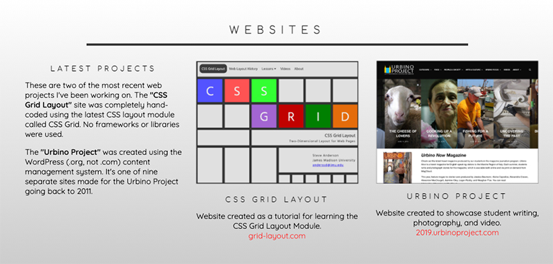
Learn more about CSS Grid on my other tutorial site at grid-layout.com.
The site's overall layout was done using CSS Grid. This section can't completely cover CSS Grid, but the essential components of this layout are shown below. The six panels on the left are each individual grid containers that differ based on how many columns each needs.
The site uses a mobile-first responsive approach and the layout shown here represents how it might look on laptops and desktops. Therefore, the CSS code shown is based on the number of columns needed for those devices. On mobile devices, each grid item would stack one on top of the other vertically down the page.
Illustration
PANEL 1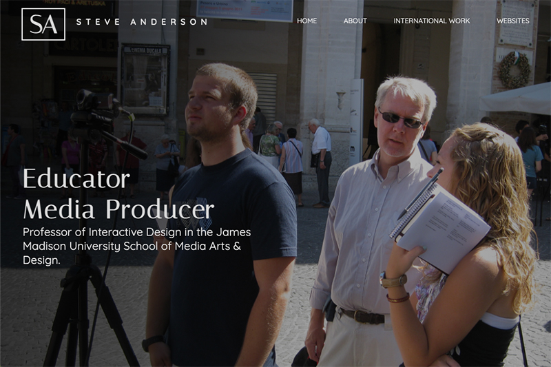
PANEL 2
PANEL 3
PANEL 4
PANEL 5
PANEL 6

HTML
<div class="panel1">
<div class="panel1-item1">Content</div>
<div class="panel1-item2">Content</div>
</div>
<!-- PANEL 2 - 2 COLUMNS -->
<div class="panel2">
<div class="panel2-item1">Content</div>
<div class="panel2-item2">Content</div>
</div>
<!-- PANEL 3 - 5 COLUMNS -->
<div class="panel3">
<div class="panel3-item1">Content</div>
<div class="panel3-item2">Content</div>
<div class="panel3-item3">Content</div>
<div class="panel3-item4">Content</div>
<div class="panel3-item5">Content</div>
</div>
<!-- PANEL 4 - 3 COLUMNS -->
<div class="panel4">
<div class="panel4-item1">Content</div>
<div class="panel4-item2">Content</div>
<div class="panel4-item3">Content</div>
</div>
<!-- PANEL 5 - 2 COLUMNS -->
<div class="panel5">
<div class="panel5-item1">Content</div>
<div class="panel5-item2">Content</div>
</div>
<!-- PANEL 6 - 2 COLUMNS -->
<div class="panel6">
<div class="panel6-item1">Content</div>
<div class="panel6-item2">Content</div>
</div>
CSS
.panel1 {
display:grid;
grid-template-columns:1fr 1fr;
}
/* PANEL 2 - 2 COLUMNS */
.panel2 {
display:grid;
grid-template-columns:1fr 1fr;
}
/* PANEL 3 - 5 COLUMNS */
.panel3 {
display:grid;
grid-template-columns:repeat(5, 1fr);
}
/* PANEL 4 - 3 COLUMNS */
.panel4 {
display:grid;
grid-template-columns:repeat(3, 1fr);
}
/* PANEL 5 - 2 COLUMNS */
.panel5 {
display:grid;
grid-template-columns:1fr 1fr;
}
/* PANEL 6 - 2 COLUMNS */
.panel6 {
display:grid;
grid-template-columns:1fr 1fr;
}
Animation on Scroll
Animation on Scroll (AOS) is a CSS library and a companion JavaScript library. Libraries are essentially just files full of useful code where you can call on some pre-written CSS classes or JavaScript functions to do specific things on your site.
AOS has documentation about how to use the libraries, but it's simple to add a few quick lines of code to create animations on your site that when scrolled to can fade, flip or zoom. Animation delay, duration and a range of other options are available.
AOS can be used in one of two ways.
1. Self-hosted: Download the CSS and JS files to your site.
2. Hosted from the AOS Content Distribution Network (CDN).
This lesson will use option number two.
Illustration
Play the video to see "Animation on Scroll" in action.HTML
<link href="https://unpkg.com/[email protected]/dist/aos.css" rel="stylesheet">
<!-- APPLY TO ELEMENT/CLASS YOU WANT TO ANIMATE -->
<div class="panel2-text" data-aos="fade-right" data-aos-duration="2000" data-aos-delay="200">
JavaScript
<!-- PLACE JUST BEFORE </body> TAG. --><script src="https://unpkg.com/aos@next/dist/aos.js"></script>
<script>
AOS.init();
</script>
Note: Too much motion can be undesirable and overwhelming. Luckily, there is a new CSS media query called prefers-reduced-motion that you can enable on your pages that allows those who choose reduced motion in their operating systems to turn off animations, transitions, transforms, and parallax scrolling. See the lesson below on User Preferences to learn how to provide that option.
Documentation: https://github.com/michalsnik/aos/blob/next/README.md
AOS Website: https://michalsnik.github.io/aos
Font Awesome
Font Awesome is a CSS library or toolkit for creating graphical icons using fonts. Libraries are essentially just files full of useful code where you can call on some pre-written CSS classes to do specific things on your site.
As vector-based fonts they are easily scalable (resizable) and can be styled using CSS to make changes to size, color etc. You can even add drop shadows.
Font awesome makes many of their font icons available without cost. To use the whole range of fonts you'd need to pay a fee.
Font Awesome can be used by downloading the fonts to your site. Follow these quick and easy steps.
1. Download Font Awesome files at:
https://fontawesome.com/how-to-use/on-the-web/setup/hosting-font-awesome-yourself
(Look for the "Download Font Awesome Free for the Web" link. )
2. Extract the downloaded .zip file.
3. Move the folder you extracted into the root folder of your website.
(As of this writing, the folder was called fontawesome-free-5.15.3-web).
4. Add the following code to use Font Awesome.
Illustration
Font Awesome icons on the home page. Three Font Awesome icons in this example.
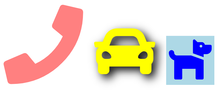
HTML
<link rel="stylesheet" href="fontawesome-free-5.15.3-web/css/all.css">
<!-- CREATES PHONE, CAR, AND DOG ICONS. -->
<div class="phone"><i class="fa fa-phone"></i></div>
<div class="car"><i class="fas fa-car"></i></div>
<div class="dog"><i class="fas fa-dog"></i></div>
CSS
/* APPLIES STYLES TO THE PHONE ICON */.phone {
color:red;
font-size:130px;
opacity:.5;
margin-right:14px;
}
/* APPLIES STYLES TO THE CAR ICON */
.car {
color:yellow;
font-size:100px;
text-shadow:6px 6px 14px #000;
margin-right:14px;
}
/* APPLIES STYLES TO THE DOG ICON */
.dog {
color:blue;
font-size:70px;
background-color:lightblue;
}
NOTE: Font Awesome uses the italic <i> tag because it is an inline element and it has been deprecated (being phased out). Because of it being deprecated, web developers are therefore not likely to use the tag elsewhere on their sites, but browsers still support it. Another option is to use <span> which would be more semantically correct and is also an inline element. It would look like this: <span class="fas fa-car"></span>
A gallery showing all the font icons available: https://fontawesome.com/icons?d=gallery
Some cool examples: https://fontawesome.com/v4.7.0/examples
Font Awesome Homepage: https://fontawesome.com
Back to Top Button
The growth of long scrolling pages and infinite scrolling on both mobile and desktop has created the need for users to quickly navigate to the top of the page without needing to scroll. This trend has led to the use of "Back to Top" buttons as a navigation shortcut. The button is usually placed in the bottom right corner of the page and remains in position (sticky) while the user scrolls up and down. (See the bottom right of this page for this page's back to top button).
This method of making a back to top button relies on CSS and a JavaScript library known as jQuery. jQuery is a lightweight and popular library that enables powerful features on your site. It's a single JavaScript file that you reference with: <script src="https://code.jquery.com/jquery-3.5.1.min.js"></script> in the <head> section of your HTML file. (See HTML section below). Place some additional code just before the </body> tag, add some CSS, and you have a functioning back to top button.
- The arrow within the button is called a "Black Rightwards Arrowhead": ➤
- It gets placed on the page as ➤ ("Unicode Decimal Code for the black rightwards arrowhead).
- Using CSS, we rotate the right backwards arrowhead 270 degrees so that it points upward and we change the color to white (#eee).
Feel free to change the CSS properties below to customize the button for your site.
Illustration
Back to Top Button
Play the video to see it in use.
HTML & JavaScript
<script src="https://code.jquery.com/jquery-3.5.1.min.js"></script>
<!-- PLACE JUST BEFORE </body> TAG -->
<div><a id="back2Top" title="Back to top" href="#">➤</a></div>
<script>
/* Scroll to top when arrow up clicked BEGIN */
$(window).scroll(function() {
var height = $(window).scrollTop();
if (height > 100) {
$('#back2Top').fadeIn();
} else {
$('#back2Top').fadeOut();
}
});
$(document).ready(function() {
$("#back2Top").click(function(event) {
event.preventDefault();
$("html, body").animate({ scrollTop: 0 }, "slow");
return false;
});
});
/* Scroll to top when arrow up clicked END */
</script>
CSS
width:30px; /* width of button */
height:20px; /* height of button */
line-height:30px;
overflow:hidden;
z-index:999;
display:none; /* initially not displayed */
cursor:pointer;
transform:rotate(270deg); /* turns right arrow 270 degrees */
position:fixed; /* fixed at bottom corner */
bottom:30px; /* distance from bottom */
right:40px; /* distance from right */
padding:4px 4px 13px 4px; /* padding around arrow */
border:1px solid #555;
border-radius:2px;
background:rgba(66, 151, 223, 0.7); /* blue background with transparency */
color:#eee; /* color of arrow */
text-align:center;
font-size:20px; /* size of the arrow */
text-decoration:none;
}
#back2Top:link {
background:rgba(66, 151, 223, 0.7);
color:#eee;
}
#back2Top:visited {
background:rgba(66, 151, 223, 0.7);
color:#eee;
}
#back2Top:hover {
background:rgba(52, 118, 174, 0.8);
color:#ccc;
}
#back2Top:active {
background:rgba(66, 151, 223, 0.7);
color:#eee;
}
jQuery Website: https://jquery.com
Auto-Fit and Auto-Fill
Responsiveness without Media Queries
One of the most powerful features in the CSS Grid specification is the ability to create responsive layouts without using media queries. This is done by using the repeat function along with auto-placement keywords auto-fit or auto-fill. These keywords allow you to place as many grid items of a particular size on a row that will fit within the width of the viewport.
An example of this in use can be seen on the Urbino, Italy page on this site. The video on the left below also shows how the number of images on a row changes based on the width of the browser. When making the viewport narrower, both auto-fit and auto-fill automatically push grid items down to another row once each of the grid items would become narrower than some specified number of pixels. Again, this is done without media queries.
The HTML markup is simple. There is a container that contains six images, each wrapped in a <div> with a class of card.
The CSS is done with CSS Grid in basically one line of code:
grid-template-columns:repeat(auto-fit, minmax(300px, auto));
This example uses the auto-fit keyword along with the minmax function. It sets each photo to be no less than 300 pixels. Auto means the image can stretch horizontally until at some point there would be room for another grid item to fit on the row.
This page shows the layout using just the code below. Try the code in your page and change 300px to some other value. You'll notice you can control how many photos appear on a row at a given width.
Download the Images for this Lesson
images.zip
Illustration
Play the video to see it in use.HTML
<div class="card">
<img src="images/urbino1.jpg"><br>
Caption below photo goes here.
</div>
<div class="card">
<img src="images/urbino2.jpg"><br>
Caption below photo goes here.
</div>
<div class="card">
<img src="images/urbino3.jpg"><br>
Caption below photo goes here.
</div>
<div class="card">
<img src="images/urbino4.jpg"><br>
Caption below photo goes here.
</div>
<div class="card">
<img src="images/urbino5.jpg"><br>
Caption below photo goes here.
</div>
<div class="card">
<img src="images/urbino6.jpg"><br>
Caption below photo goes here.
</div>
</div>
CSS
display:grid;
grid-template-columns:repeat(auto-fit, minmax(300px, auto));
}
.card {
margin:.7rem;
text-align:center;
}
/* FOR RESPONSIVE IMAGES */
img {
max-width:100%;
height:auto;
}
Learn more about auto-fit and auto-fill on my CSS Grid website: http://grid-layout.com.
Watch my instructional video about auto-fit and auto-fill: Instructional Videos.
Hide Header on Scroll Down
Fixed position headers/menus have many benefits. The main advantage is that they never leave the screen when a user scrolls, thus making the menu/navigation easy to access. This is especially helpful on long scrolling pages with a great deal of content.
The main disadvantage is that fixed navigation will always take up a portion of your valuable screen real-estate and thus hide other content. This is an even bigger problem on small screens or mobile devices.
It would be better if one could hide the menu/header when a user scrolls down, but then show it again when a user scrolls up.
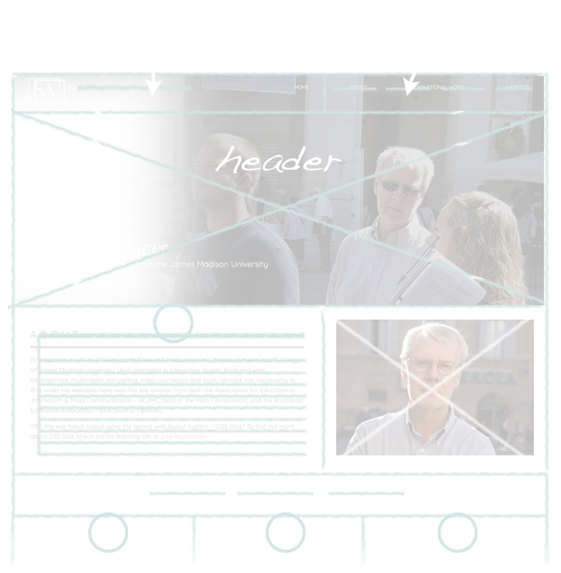
You can see an example of this in action on this site. Right now, scroll up slightly. Notice that the header/navigation slides down from the top and back into view. Scroll down and watch it slide off the top of the page. We will make a simplified version of this approach, such as seen at drsteveanderson.com/scroll-nav.html.
Making this happen will require CSS3 transitions and a little JavaScript. We will set the default header position to fixed. When the user scrolls down, we'll use JavaScript to add a class to move the header up and out of the viewport. Then, we'll remove the class to show the header again on scroll up.
HTML
<body class="scroll-up">
<header>
<div class="logo">
<a href="#">STEVE ANDERSON</a>
</div>
<nav>
<a href="#">HOME</a>
<a href="#">ABOUT</a>
<a href="#">PRODUCTS</a>
<a href="#">CONTACT</a>
</nav>
</header>
<div class="container">
<!-- Add the following paragraph several times to make your page require scrolling. -->
<section>
<p>Text goes in this area. Text goes in this area. Text goes in this area. Text goes in this area. Text goes in this area. Text goes in this area. Text goes in this area. Text goes in this area. Text goes in this area. Text goes in this area. Text goes in this area. Text goes in this area. </p>
</section>
</div>
</body>
JAVASCRIPT
<script>
const body = document.body;
let lastScroll = 0;
window.addEventListener('scroll', () => {
const currentScroll = window.pageYOffset;
if (currentScroll <= 0) {
body.classList.remove("scroll-up")
}
if (currentScroll > lastScroll && !body.classList.contains("scroll-down")) {
body.classList.remove("scroll-up")
body.classList.add("scroll-down")
}
if (currentScroll < lastScroll && body.classList.contains("scroll-down")) {
body.classList.remove("scroll-down")
body.classList.add("scroll-up")
}
/* The number 70 below pertains to how far down from the top one needs to scroll to begin hiding the header. */
if (currentScroll <= 70) sticky.addClass('scroll-up')
lastScroll = currentScroll;
});
</script>
CSS
.logo {
padding-bottom:20px;
}
nav {
display:flex;
justify-content:space-around;
}
.container {
background:#eeeeee;
}
a:link {
color:#ffffff;
}
a:visited {
color:#ffffff;
}
a:hover {
color:#ffffff;
}
a:active {
color:#ffffff;
}
section {
margin-top:170px; /* Adjust to keep section from starting too high on page. */
}
/* MENU SCROLL STYLES */
header {
position:fixed;
top:0;
left:0;
width:100%;
height:80px; /* Adjust as needed. */
z-index:99; /* Keeps menu on top. */
transition: all 300ms ease-in-out; /* Animation */
background-color:#222222;
padding:40px;
}
.scroll-down header {
background: #222222;
transform:translate3d(0, -200%, 0); /* Moves menu off the top when scrolling down. */
}
.scroll-up header {
background: #222222;
}
Shape Dividers
Shape dividers allow you to create shapes (such as waves or triangles) between panels on a page. By default, boxes or DIVs on a page stack one on top of the other. Creating something other than a horizontal separation between boxes requires a little trickery using an SVG (Scalable Vector Graphic) that is inserted between the two page elements.
The images below illustrate how an SVG can be used to make a shape.
Normally, the division between two page elements (the black and white panels) is a straight horizontal line.
There is now a wavy line separating the black and white panels.
Below are links to four examples.
- Wave Divider
- Wave Dividers with Opacity Changes
- Tilted Divider
- Triangle Divider
Creating SVGs can be a bit complicated. Luckily, there is a resource that allows us to easily create the shape we want and it will generate both the HTML and CSS we need to implement it on our own sites.
FOLLOW THE STEPS BELOW
Go to the following website: shapedivider.app.
1. Make adustments to the elements shown below, along with the height and width.
2. Download the code using the cloud icon.
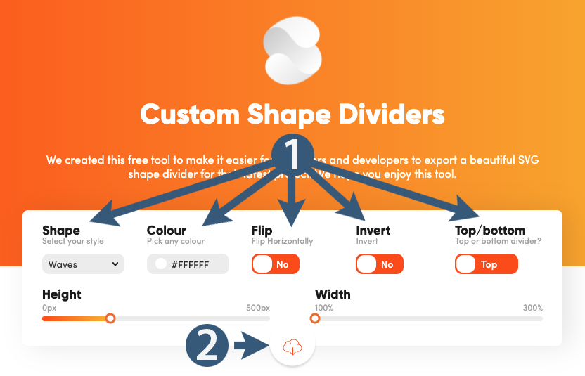
We will make the example above that uses a wave divider. The code in BLUE was derived from the website above.
HTML
<div class="container">
<div class="box1">
<p>Box one content goes here. Box one content goes here. Box one content goes here. Box one content goes here. Box one content goes here. Box one content goes here. Box one content goes here. Box one content goes here. Box one content goes here.</p>
</div>
<!-- WAVE STARTS HERE -->
<div class="wave">
<div class="custom-shape-divider-top-1629828993">
<svg data-name="Layer 1" xmlns="http://www.w3.org/2000/svg" viewBox="0 0 1200 120" preserveAspectRatio="none">
<path d="M985.66,92.83C906.67,72,823.78,31,743.84,14.19c-82.26-17.34-168.06-16.33-250.45.39-57.84,11.73-114,31.07-172,41.86A600.21,600.21,0,0,1,0,27.35V120H1200V95.8C1132.19,118.92,1055.71,111.31,985.66,92.83Z" class="shape-fill">
</path>
</svg>
</div>
</div>
<!-- WAVE ENDS HERE -->
<div class="box2">
<p>Box two content goes here. Box two content goes here. Box two content goes here. Box two content goes here. Box two content goes here. Box two content goes here. Box two content goes here. Box two content goes here. </p>
</div>
</div>
CSS
body {
background-color: #66f;
margin:0;
}
.container {
display:flex;
flex-direction: column;
justify-content: center;
margin:0 auto;
}
.box1 {
background-color:#cfc; /* Green color for first box */
padding:0 25%;
}
.box2 {
background-color:#f66; /* Red color for second box. */
padding:60px 25%;
}
/* WAVE STYLES */
.wave {
position:relative; /* Must be position:relative */
margin:0;
padding:0;
}
.custom-shape-divider-top-1629828993 {
position: absolute; /* Must be position:absolute */
top: 0;
left: 0;
width: 100%;
overflow: hidden;
line-height: 0;
transform: rotate(180deg);
}
.custom-shape-divider-top-1629828993 svg {
position: relative;
display: block;
width: calc(136% + 1.3px);
height: 57px;
}
.custom-shape-divider-top-1629828993 .shape-fill {
fill:#cfc; /* Green color for the wave */
}
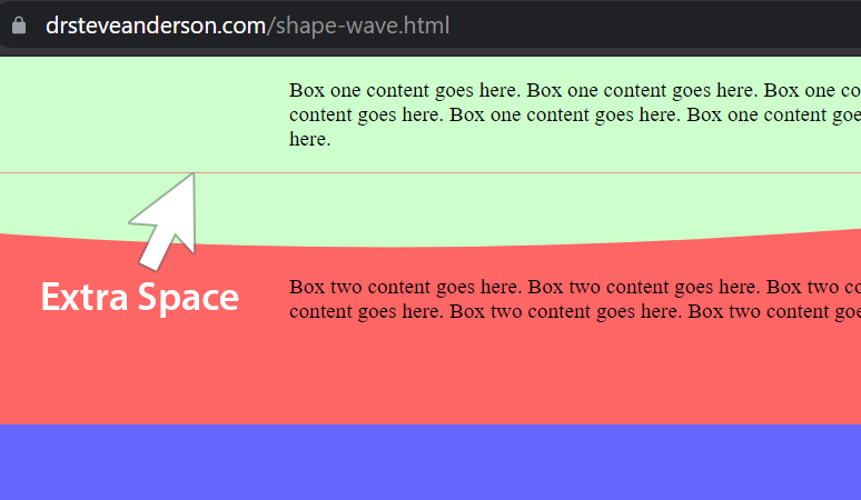
NOTE: There is a problem in Chrome for Windows where the browser puts an extra line of space at the top of the shape. The problem is illustrated below and then a fix is shown.
Notice the narrow horizontal space that looks like a red line.
The problem is fixed by adding a negative margin as shown below.
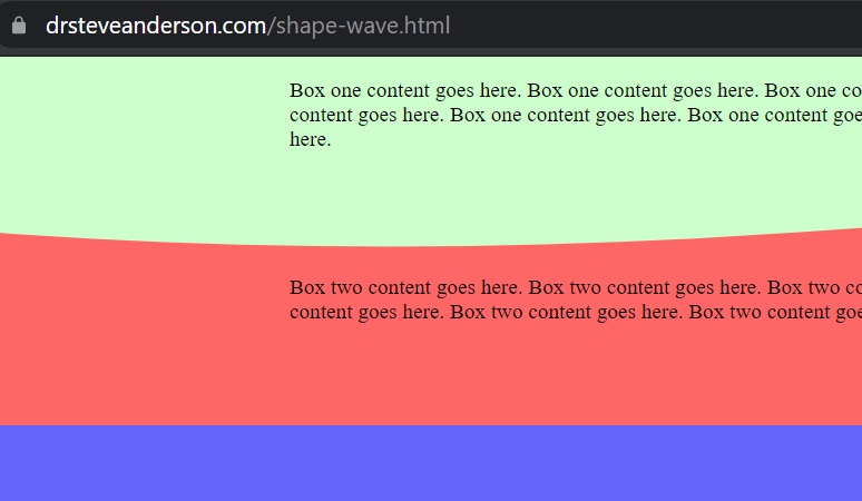
CSS
/* ADD THE FOLLOWING LINE OF CSS SHOWN IN BLUE */.custom-shape-divider-top-1629828993 {
margin-top:-1px;
}
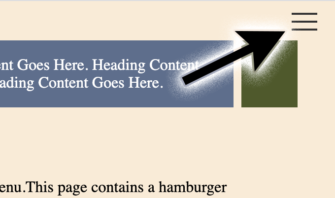
Responsive Hamburger Menu
The controversial "hamburger menu"
There has been a great deal of debate about the effectiveness of the hamburger icon/button/menu. It was invented in the late 1970s by Norm Cox for the Xerox "Star" personal workstation, the world’s first graphical user interface. The simple three line icon was originally meant to convey a list of items, but it was eventually found useful for navigation on mobile devices with small screens. (A good history can be found here).
Critics claim that from a user experience standpoint it is ambiguous and not everyone understands that clicking on it brings up a menu. Plus, it requires an extra click or tap to get to the menu and decreases navigation clicks overall. Proponents say it's a useful method for handling navigation on small devices and frees up screen space. Plus, its use for menus may now have reached a level where there's little confusion about what it communicates.
One thing is certain — if you're going to use a hamburger menu, don't place it on the left side of the screen. That's the hardest area to reach for a right-handed user and about 90% of people are right-handed. (Sorry left-handers).
In this lesson, we'll learn how to create a hamburger menu for mobile devices and narrow browser viewports that will convert to a regular "on page" menu when the browser reaches a minimum width of 900 pixels.
The menu can be done without JavaScript (HTML & CSS only) as long as none of the links are internal anchor links. (These are links that go not to a separate page, but rather to a section of the page farther down). If using internal anchors, you'll need to use the JavaScript below to get the menu to collapse after clicking on one of those links.
The page will contain a header in a <div> with a class of header-left. The navigation will be contained entirely within a <div> with a class of header-right.
Another feature of this lesson involves how to hide some of the navigation once the browser gets to 900 pixels width. That's shown below with a <div> with a class of hide. If you don't need to do that, simply remove <div class="hide"> and the closing </div> tags that surround those links.
If you don't need to indent any of the items in your hamburger menu, simply remove the nested unordered list <ul> and </ul> tags shown below for the "Urbino, Italy" and "Florence, Italy" links.
The code below is what was used to create the hamburger menu on this site, though it's been stripped down to its essential features for this lesson. An example of what we are about to create can be seen at drsteveanderson.com/hamburger.html. Here are links to two other files with slight changes to the layout (Link 1 | Link 2).
NOTE: In order to see the effect of the internal anchor links you'll need to add a few more paragraphs of text to the bottom of the page.
Illustration
See the hamburger menu in action.See what we'll create.
 drsteveanderson.com/hamburger.html
JavaScript
Only needed if you have internal anchor links in the menu. It will collapse the menu after clicking on an internal anchor link. -->
<script>
window.addEventListener("hashchange", () => {
document.getElementById("menu__toggle").checked = false; });
</script>
HTML
<!-- PLACE IN THE <body> SECTION. --><div class="container">
<div class="header-left">
<p>Heading Content Goes Here. Heading Content Goes Here. Heading Content Goes Here. Heading Content Goes Here. Heading Content Goes Here. Heading Content Goes Here. Heading Content Goes Here.</p>
</div>
<div class="header-right">
<input id="menu__toggle" type="checkbox" />
<label class="menu__btn" for="menu__toggle">
<span></span>
</label>
<ul class="menu__box">
<li><a href="hamburger.html">Home</a></li>
<li><a href="hamburger.html#first">Section One</a></li>
<li><a href="hamburger.html#second">Section Two</a></li>
<div class="hide"> <!-- hides the following links at 900 pixels and greater -->
<ul>
<li><a href="urbino.html">Urbino, Italy</a></li>
<li><a href="florence.html">Florence, Italy</a></li>
</ul>
</div>
</ul>
</div>
<section>
<h2 id="first">First Section of Content</h2>
<p>This page contains a hamburger menu. This page contains a hamburger menu. This page contains a hamburger menu. This page contains a hamburger menu. This page contains a hamburger menu. This page contains a hamburger menu.</p>
<h2 id="second">Second Section of Content</h2>
<p>This page contains a hamburger menu. This page contains a hamburger menu. This page contains a hamburger menu. This page contains a hamburger menu. This page contains a hamburger menu. This page contains a hamburger menu.</p>
</section>
</div>
CSS
body {
margin:0;
}
.container {
display:grid;
grid-template-columns:repeat(12, 1fr);
grid-gap:4px 8px;
padding:40px;
background-color:antiquewhite;
}
.header-left {
grid-column:1/12;
color:white;
background-color:#5E6D8C;
}
.header-right {
grid-column:12/13;
background-color:#4F592C;
}
section {
grid-column:1/13;
}
.header-right ul li {
list-style: none;
padding:4px 0;
}
.header-right ul ul li {
margin-left:-28px;
}
a:link {
color:white;
text-decoration:none;
}
a:visited {
color:white;
text-decoration:none;
}
a:hover {
color:white;
text-decoration:underline;
}
a:active {
color:white;
text-decoration:none;
}
/* HAMBURGER MENU STYLES */
#menu__toggle {
display:none;
}
#menu__toggle:checked + .menu__btn > span {
transform: rotate(45deg);
}
#menu__toggle:checked + .menu__btn > span::before {
top: 0;
transform: rotate(0deg);
}
#menu__toggle:checked + .menu__btn > span::after {
top: 0;
transform: rotate(90deg);
}
#menu__toggle:checked ~ .menu__box {
right: 0 !important;
}
.menu__btn {
position: absolute;
top: 20px;
right: 20px;
width: 26px;
height: 26px;
cursor: pointer;
z-index: 1;
}
.menu__btn > span,
.menu__btn > span::before,
.menu__btn > span::after {
display: block;
position: absolute;
width: 100%;
height: 2px;
background-color: #333;
transition-duration: .25s;
}
.menu__btn > span::before {
content: '';
top: -8px;
}
.menu__btn > span::after {
content: '';
top: 8px;
}
.menu__box {
display: block;
position: fixed;
top: 30px;
right: -100%;
height: auto;
padding:18px;
background-color:rgba(51, 51, 51, .8);
box-shadow: -2px 2px 9px rgba(0, 0, 0, .4);
}
.menu__item {
display: block;
padding: 9px 44px 9px 0;
color: #333;
}
.menu__item:hover {
background-color: rgba(235, 140, 140, 0.3);
}
/* HAMBURGER GOES AWAY AT 900PX */
@media only screen and (min-width:900px) {
.header-left {
grid-column:1/13;
}
.header-right {
grid-column:1/13;
}
.hide {
display:none;
}
.menu__toggle {
display:inline;
}
.menu__btn {
display:none;
}
.menu__box {
display:flex;
flex-direction:row;
justify-content:space-around;
position: initial;
background-color:#aa5555;
padding:10px;
box-shadow: none;
}
.menu__item {
color:white;
display: block;
padding: 0 0;
color: #333;
text-decoration: none;
}
}
Background Image Tricks
Parallax Scrolling | Above-the-Fold Header | Darkened Background Image
This section contains three lessons in one (for no extra charge).
1. Parallax Scrolling
First, we'll create a panel at the top of the page that uses what's called "parallax scrolling." Parallax scrolling is where the background image stays fixed while content on top of it scrolls up and down over it. In other cases, there might be multiple layers moving at different speeds. The visual effect creates the illusion of depth along the z-axis.
NOTE: Parallax scrolling using a fixed background image does not work on iOS devices (iPhones and iPads). However, you can use media queries to turn off the effect on mobile devices.
To create the parallax effect, we simply add background-attachment:fixed; and the three lines below it.
background-repeat: no-repeat; /* The background image will not repeat */
background-position: right top; /* Sets the starting position of a background image horizontally and vertically. */
background-size: cover; /* Resize the background image to cover the entire container, even if it has to stretch the image or cut off one of the edges. */
2. Above-the-Fold Header
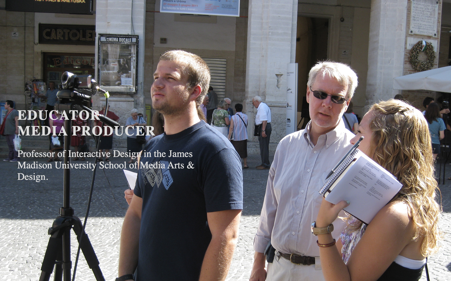
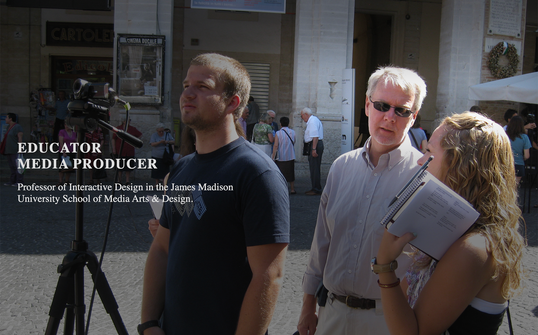
Second, we'll make the top panel fill the entire browser window (viewport) regardless of the size or shape of the window and regardless of what kind of device it's being viewed on. This allows an "above the fold" layout where you determine what the viewer sees before they start to scroll. The term "above the fold" comes from the world of newspapers where the most important material could be laid out above the fold on a newspaper as it sat in a newsstand. To make this happen, we'll simply add height:100vh; (vh stands for viewport height) to the <header> element which contains the background image.
3. Darkened Background Image
Because we'll be placing text on top of the image we'll want to darken the image to provide better contrast. There are multiple ways to do that. The easiest way to do it might be to simply darken the image (reduce brightness) in Photoshop. However, a more effective method would be to use CSS to darken the image. One can't simply apply background-color:rgba(0, 0, 0, .5); because the background image would sit on top of it.
Option 1: background-blend-mode property
We'll need to use a property known as background-blend-mode. This property allows us to add a background color such as black background-color:rgba(0, 0, 0, 0.5); with 0.5 opacity and have it overlay the background image background-image:url("images/blend1.jpg");
Note in the code below that we have both a background image and a background color, but now both work because we've added the background-blend-mode property.
CSS - Overlaying a Background Color
/* NOTE THE THREE LINES HIGHLIGHTED IN BLUE BELOW */.panel1 {
background-repeat: no-repeat;
background-attachment:fixed;
background-position: center center;
background-size: cover;
background-image:url("images/blend1.jpg");
background-color:rgba(0, 0, 0, 0.5);
background-blend-mode:darken;
}
The result can be seen at: drsteveanderson.com/blend-color.html
The approach also works when overlaying two images, but you can get some pretty funky results when using this method. An example can be seen at: drsteveanderson.com/blend-images.html. Below shows the two separate images and the result after blending.
Note in the code below that blend2.jpg overlays blend1.jpg and that we have changed the value from darken to overlay. We have removed the background-color property by commenting it.
CSS - Overlaying Two Images
/* NOTE THE LINES HIGHLIGHTED IN BLUE BELOW */.panel1 {
background-repeat: no-repeat;
background-attachment:fixed;
background-position: center center;
background-size: cover;
background-image:url("images/blend1.jpg"), url("images/blend2.jpg");
/* background-color:rgba(0, 0, 0, 0.5); */
background-blend-mode:overlay;
}
The CSS background-blend-mode property emulates the blending options found in the popular image editing program Adobe Photoshop. It takes two pixels laid on top of each other and combines them in different ways.
The background-blend-mode property allows the following values:
normal | multiply | screen | overlay | darken | lighten | color-dodge | saturation | color | luminosity
Option 2: linear-gradient
Sometimes, you may want some parts of the image to be darker than other parts. That is the case with the background image at the top of my home page. The text is on the left side of the layout, so we want to darken that area of the image more than the right side.
To do this, we'll use a linear gradient in conjunction with the background image. A linear gradient consists of two or more colors (or shades) along a straight line. Our code looks like this.
background: linear-gradient(to right, rgba(0,0,0,0.8), rgba(0,0,0,0.7), rgba(0,0,0,0.4), rgba(0,0,0,0.3), rgba(0,0,0,0.4)), url("images/background-panel1.jpg");
Notice that this one line of code includes both a black linear gradient with changes horizontally (left to right) to the alpha (opacity) at five different "stops" and a background image (background-panel1.jpg). Each stop is black (0,0,0), but we are varying the amount of opacity at each stop horizontally across the image.
Since the text will be on the left side of the layout, we have made the first stop the darkest with an opacity of point 8 (0.8). (The lower the value, the more transparent). We want the least darkening to be on the right side, so we've given that an opacity of point 3 (0.3) on the fourth stop.
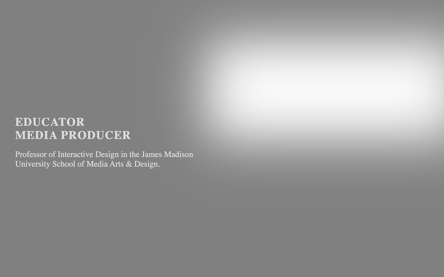
Text on top of background image with no darkening.
Linear gradient shown without the background image.
Text on top of background image with linear gradient applied.

We will create a page with parallax scrolling, an above-the-fold header, and a linear-gradient for shading like this one drsteveanderson.com/background-image.html
Download the Image for this Lesson
images.zip
Illustration
See parallax scrolling in action.See the above-the-fold header.
HTML
<div class="container">
<header>
<div class="header-text">
<h1 class="header-large">
Educator<br>
Media Producer
</h1>
<div class="header-small">Professor of Interactive Design in the James Madison University School of Media Arts & Design.
</div>
</div>
</header>
<div class="panel2">
<h2>About</h2>
<p>This is the second panel, which lies just below the header. This is the second panel, which lies just below the header. This is the second panel, which lies just below the header. This is the second panel, which lies just below the header. This is the second panel, which lies just below the header. </p>
<p>This is the second panel, which lies just below the header. This is the second panel, which lies just below the header. This is the second panel, which lies just below the header. This is the second panel, which lies just below the header. This is the second panel.<p>
</div>
</div>
CSS
box-sizing: border-box;
margin:0;
padding:0;
}
body {
margin:0;
font-size:1em;
}
img {
max-width:100%;
height:auto;
}
h1 {
text-transform: uppercase;
}
h2 {
text-transform: uppercase;
font-size:1.2rem;
letter-spacing:.5rem;
padding-bottom:14px;
border-bottom:solid 5px #666;
}
.container {
display:grid;
grid-template-columns:1fr 1fr;
grid-auto-rows:minmax(80px, auto);
}
header {
grid-column:1/3;
display:flex;
flex-direction:column;
justify-content:center;
height:100vh; /* Above-the-Fold */
background: linear-gradient(to right, rgba(0,0,0,0.8), rgba(0,0,0,0.7), rgba(0,0,0,0.4), rgba(0,0,0,0.3), rgba(0,0,0,0.4)), url("images/background-panel1.jpg"); /* Background Darkening */
background-attachment:fixed; /* Paralax Scrolling */
background-repeat: no-repeat;
background-position: right top;
background-size: cover;
}
.header-text {
padding-right:20%;
color:#ddd;
height:100%;
margin-left:40px;
display:flex;
flex-direction:column;
justify-content:center;
}
.header-large {
letter-spacing:.1rem;
font-size:1.6rem;
}
.header-small {
font-size:1.2rem;
}
.panel2 {
grid-column:1/3;
color:#333;
padding:20px 40px;
z-index:2;
}
/* SLIGHT CHANGE AT 900 PIXELS */
@media only screen and (min-width:900px) {
.header-large {
font-size:1.8rem;
}
.header-small {
font-size:1.3rem;
}
.header-text {
padding-right:50%;
}
}
/* FIXES BACKGROUND IMAGE ON IOS DEVICES
Device-width refers to the width of the device itself, not the size of a browser viewport. */
@media only screen and (max-device-width:1024px) {
header {
background-attachment: scroll;
}
}
Option 3: Pseudo-Element Vignette
Another approach to darkening the background image is seen below with a pseudo element. Pseudo elements are used to insert content before, or after, the content of an element. In this case, we use an "after" pseudo element that looks like this. header::after
This method will use a vignette effect created with the box-shadow property to darken the outer edges of the image. In this case, it also leaves a lighter area on the right side of the screen.
Text on top of background image with no vignette.
Box shadow shown without the background image.
Text on top of background image with vignette applied.
Make the additions and changes below and see the effect.
CSS - Pseudo-Element
/* MAKE THE FOLLOWING CHANGES */header {
grid-column:1/3;
display:flex;
flex-direction:column;
justify-content:center;
height:100vh;
background:url("images/background-panel1.jpg"); /* Background image */
background-attachment:fixed;
background-repeat: no-repeat;
background-position: right top;
background-size: cover;
}
/* ADD THIS FOR A VIGNETTE */
header::after { /* Pseudo element adds the following after content of header element */
content: '';
height:100vh;
position: absolute;
top: 0; left: 0; bottom: 0; right: 0;
opacity:0.5;
box-shadow: inset 280px -120px 390px 240px #000; /* Creates a shadow inside the element's frame when using "inset". Values after inset are: horizontal offset, vertical offset, blur, spread, and color. */
}
/* MAKE THE FOLLOWING CHANGES */
.header-text {
padding-right:20%;
color:#ddd;
height:100%;
margin-left:40px;
display:flex;
flex-direction:column;
justify-content:center;
z-index:100; /* Add a high z-index to put text on top of vignette */
}
The completed page using a vignette can be seen here: drsteveanderson.com/background-image-vignette.html
Responsive Slideshow
A slideshow is a sequence of images, most often with captions, that the user can manually cycle through one-by-one. Often, the slideshow is set up to automatically advance the slides over a certain interval of time.
You can see an example of a slideshow on the London, England page. Another example with a different look to the previous and next buttons can be seen on the Istanbul, Turkey page.
Slideshows utilize HTML, JavaScript, and CSS. Other than a few adaptations, the majority of the code for the slideshow in this lesson comes from W3schools.com.
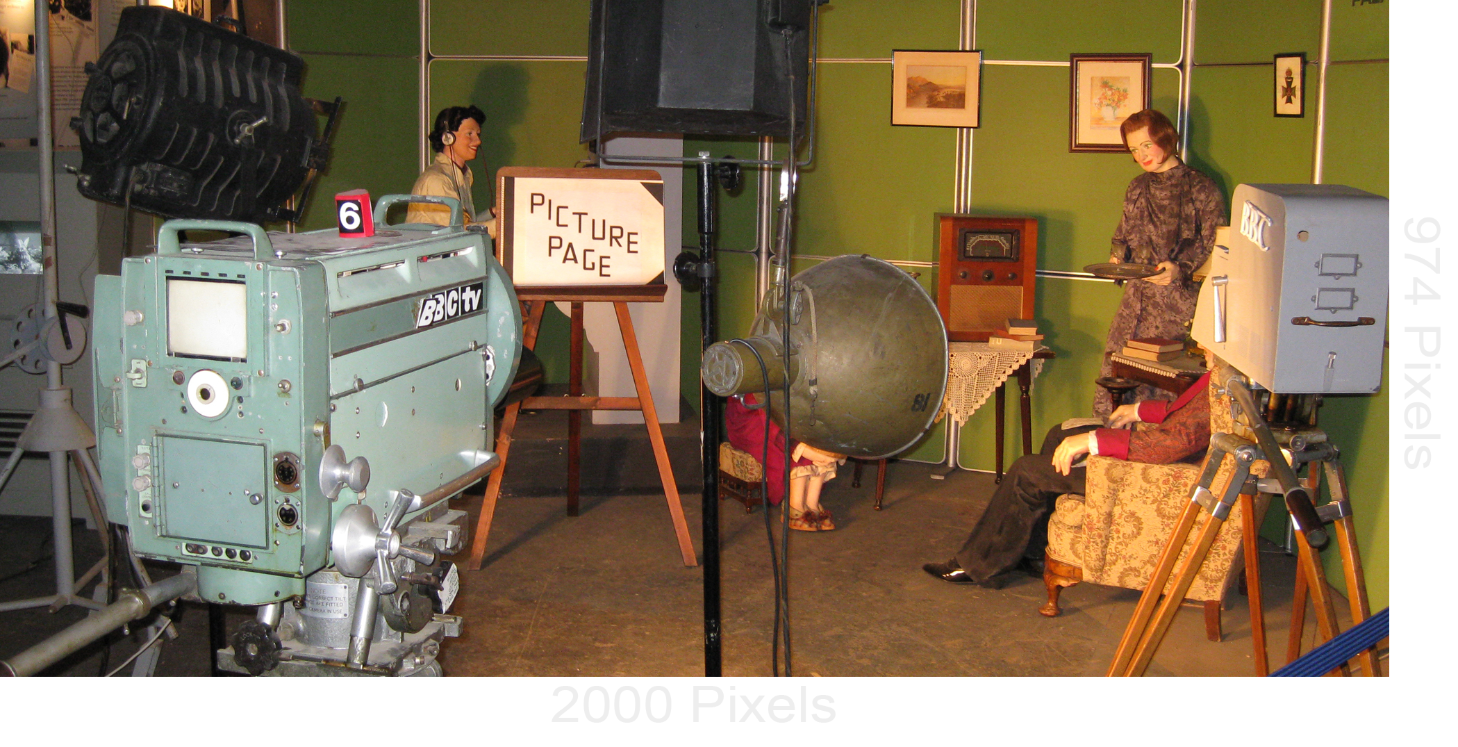
To begin, you'll want to assemble a number of images that are all the same size and shape. You can use as few as two images in a slideshow, but most of the time they will contain somewhere between about 3 and 15 images.
We want the images to fill up the entire browser window from side-to-side, so we'll use rather large images. The images used in this lesson are all 2000 pixels X 974 pixels.
We will create a simple slideshow with four images, such as this one: drsteveanderson.com/slideshow.html
Download the Images for this Lesson
images.zip
Illustration
See the slideshow/carousel.HTML
<div class="container">
<header>
<h2>Slideshow/Carousel</h2>
<!-- SLIDESHOW BEGINS -->
<div class="slideshow-container">
<!-- First Slide Below -->
<div class="mySlides fade">
<div class="numbertext">1 / 4</div>
<img src="images/slide1.jpg" style="width:100%;">
<div class="text"><p>Students arriving at Madison House after their flights to London Heathrow.</p></div>
</div>
<!-- Second Slide Below -->
<div class="mySlides fade">
<div class="numbertext">2 / 4</div>
<img src="images/slide2.jpg" style="width:100%;">
<div class="text"><p>A group shot at the Tower of London.</p></div>
</div>
<!-- Third Slide Below -->
<div class="mySlides fade">
<div class="numbertext">3 / 4</div>
<img src="images/slide3.jpg" style="width:100%;">
<div class="text"><p>The broadcasting museum at Alexandra Palace.</p></div>
</div>
<!-- Fourth Slide Below -->
<div class="mySlides fade">
<div class="numbertext">4 / 4</div>
<img src="images/slide4.jpg" style="width:100%;">
<div class="text"><p>On the hill known as Arthur's Seat in Edinburgh, Scotland.</p></div>
</div>
<!-- Previous & Next Buttons Below -->
<a class="prev" onclick="plusSlides(-1)">❮</a>
<a class="next" onclick="plusSlides(1)">❯</a>
</div><br>
<!-- Dots Begin Below (Remove or add more as needed). -->
<div class="dotWrapper">
<span class="dot" onclick="currentSlide(1)"></span>
<span class="dot" onclick="currentSlide(2)"></span>
<span class="dot" onclick="currentSlide(3)"></span>
<span class="dot" onclick="currentSlide(4)"></span>
</div>
<!-- SLIDESHOW END -->
</header>
<div class="panel2">
<h2>About</h2>
<p>This is the second panel, which lies just below the header. This is the second panel, which lies just below the header. This is the second panel, which lies just below the header. This is the second panel, which lies just below the header. This is the second panel, which lies just below the header. </p>
</div>
</div>
JAVASCRIPT
<script>
var slideIndex = 1;
showSlides(slideIndex);
function plusSlides(n) {
showSlides(slideIndex += n);
}
function currentSlide(n) {
showSlides(slideIndex = n);
}
function showSlides(n) {
var i;
var slides = document.getElementsByClassName("mySlides");
var dots = document.getElementsByClassName("dot");
if(n > slides.length) {
slideIndex = 1
}
if(n < 1) {
slideIndex = slides.length
}
for(i = 0; i < slides.length; i++) {
slides[i].style.display = "none";
}
for(i = 0; i < dots.length; i++) {
dots[i].className = dots[i].className.replace(" active", "");
}
slides[slideIndex - 1].style.display = "block";
dots[slideIndex - 1].className += " active";
}
</script>
CSS
html {
box-sizing: border-box;
margin:0;
padding:0;
}
body {
margin:0;
font-size:1em;
font-family:Arial,Helvetica,sans-serif;
}
/* GENERAL STYLES */
h2 {
text-transform: uppercase;
font-size:1.2rem;
margin:15px 40px;
letter-spacing:.5rem;
padding-bottom:14px;
border-bottom:solid 5px #666;
}
/* LAYOUT STYLES */
.container {
display:grid;
grid-template-columns:1fr 1fr;
grid-auto-rows:minmax(80px, auto);
}
header {
grid-column:1/3;
}
.panel2 {
grid-column:1/3;
color:#333;
padding:20px 40px;
z-index:2;
}
/* SLIDESHOW STYLES */
.mySlides {
display: none
}
.slideshow-container {
position: relative;
margin: auto;
}
/* Next & previous buttons */
.prev,
.next {
cursor: pointer;
position: absolute;
top: 50%;
width: auto;
padding: 16px;
margin-top: -22px;
color: white;
background-color:rgba(0, 0, 0, .5);
font-weight: bold;
font-size: 18px;
transition: 0.6s ease;
border-radius: 0 3px 3px 0;
user-select: none;
}
/* Position the "next button" to the right */
.next {
right: 0;
border-radius: 3px 0 0 3px;
}
/* On hover, add a black background color with a little bit see-through. text-decoration set to none to remove underline. */
.prev:hover,
.next:hover {
background-color: rgba(0, 0, 0, 0.8);
text-decoration:none;
}
/* Caption text */
.text {
color: #ffffff;
font-size: 15px;
padding: 4px 52px 0 12px;
position: absolute;
left:44px;
right:44px;
bottom: 8px;
text-align: center;
background-color:rgba(30, 30, 30, 0.6);
}
.text p {
margin-top:12px;
}
/* Number text (1/3 etc) */
.numbertext {
color: #ffffff;
font-size: 12px;
padding: 8px 52px;
position: absolute;
top: 0;
}
/* The dots/bullets/indicators */
.dotWrapper {
display:flex;
justify-content:center;
padding-bottom:14px;
}
.dot {
cursor: pointer;
height: 15px;
width: 15px;
margin: 2px 10px 10px 10px;
background-color: #999999;
border-radius: 50%;
display: inline-block;
transition: background-color 0.6s ease;
}
.active,
.dot:hover {
background-color: #111111;
}
/* Fading animation */
.fade {
-webkit-animation-name: fade;
-webkit-animation-duration: 1.5s;
animation-name: fade;
animation-duration: 1.5s;
}
@-webkit-keyframes fade {
from {
opacity: .4
}
to {
opacity: 1
}
}
@keyframes fade {
from {
opacity: .4
}
to {
opacity: 1
}
}
/* On smaller screens, decrease text size */
@media only screen and (max-width: 300px) {
.prev,
.next,
.text {
font-size: 11px
}
}
Automatic Slideshow
Here is an example of a slideshow that automatically advances the slides: drsteveanderson.com/slideshow-auto.html
To create a slideshow that runs automatically, remove or comment the HTML for the previous and next buttons, as well as for the dots (shown with strikethrough below). Then, replace the JavaScript above with the JavaScript below. Note that it is set to advance the images every 3 seconds. To use more or less time, change 3000 to a different value.
HTML
<!-- REMOVE OR COMMENT THE FOLLOWING HTML SHOWN WITH A STRIKETHROUGH --><a class="next" onclick="plusSlides(1)">❯</a>
<span class="dot" onclick="currentSlide(1)"></span>
<span class="dot" onclick="currentSlide(2)"></span>
<span class="dot" onclick="currentSlide(3)"></span>
<span class="dot" onclick="currentSlide(4)"></span>
</div>
JavaScript
/* REPLACE THE JAVASCRIPT ABOVE WITH THIS JAVASCRIPT */<script>
var slideIndex = 0;
showSlides();
function showSlides() {
var i;
var slides = document.getElementsByClassName("mySlides");
for (i = 0; i < slides.length; i++) {
slides[i].style.display = "none";
}
slideIndex++;
if (slideIndex > slides.length) {slideIndex = 1}
slides[slideIndex-1].style.display = "block";
setTimeout(showSlides, 3000); /* Change image every 3 seconds */
}
</script>
User Preferences
In this section, we'll look at two of the newest CSS features that give users the power to determine how they want content on the page displayed based on settings in their operating systems. Media Queries Level 5 introduced so-called "preference media features" that use media queries to detect a user's preferred way to display content.
Two new media queries are shown in this lesson. The first one allows users to reduce or eliminate movement on their screens such as animations, transitions, and transforms. The second one allows users to switch from "light mode" to "dark mode" and vice versa. Browser support is relatively good for both features.
See: https://caniuse.com/?search=prefers-reduced-motion
See: https://caniuse.com/?search=prefers-color-scheme
1. Prefers Reduced Motion
Not everyone appreciates fancy animations and transitions. Too much animation and parallax scrolling can be overwhelming and distracting. In some cases, people may even get motion sickness from too much movement on the screen. Motion sensitivity disorders may cause dizziness, migraine headaches, and even nausea.
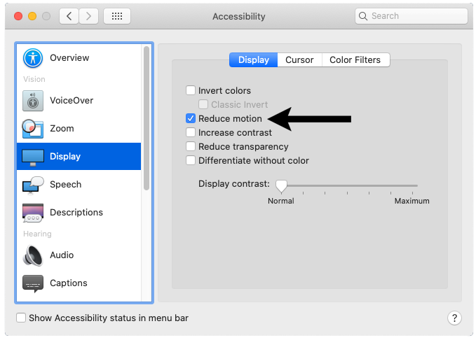
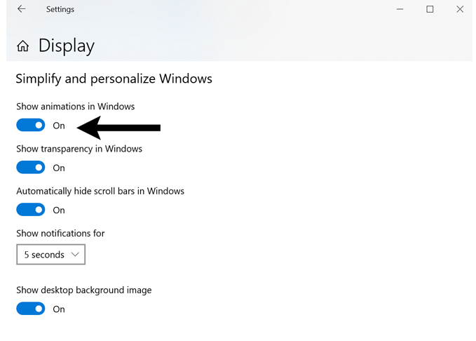
Fortunately, there is a "reduce motion" setting in most operating systems. Those with motion sensitivity and those who simply want less motion can enable the setting in their device's preferences or settings.
System Preferences > Accessibility > Display > Reduce Motion
Start > Settings > Ease of Access > Display > Simplify and personalize Windows > Show animations in Windows (turn off).
Enable the setting on your device, then look at my portfolio home page to see how it removes the animations and the parallax scrolling effect. drsteveanderson.com
In order for the setting to work, web developers need to create pages that enable a new CSS media query known as prefers-reduced-motion. Note the @media (prefers-reduced-motion: reduce) media query in the lesson below.
Illustration
Changing settings in macOS.Changing settings in Windows 10.
CSS
@media (prefers-reduced-motion: reduce) {
* { /* Asterisk is universal selector */
transition-property: none !important;
transform: none !important;
animation: none !important;
background-attachment: scroll !important;
}
}
The code above could be added to every page. Those who want animation will still see it, but those who prefer a non-amination experience will have that as well.
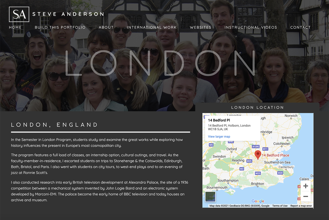
2. Prefers Color Scheme
There has long been a bias against webpages with dark backgrounds. Light backgrounds have been considered cleaner and more professional. However, webpages with dark backgrounds can be elegant or dramatic and have been favored by entertainment (films, music, theater) sites that want to convey a sense of drama and excitement.
Dark backgrounds can actually be easier on the eyes and help you focus on your work. (Source) It's even been proposed that use of electronic devices before bedtime can lead to difficulty sleeping and shorter sleep duration. Using dark mode may help limit these problems.
Pages with dark backgrounds tend to draw less power and therefore lengthen battery life. That also means using less electricity for recharging. Power savings can be up to 60 percent. (Source)
Some websites have utilized a "dark mode" toggle switch allowing users to change between dark and light mode on their sites. This has generally been done with differential CSS and JavaScript. (Example)
Thanks to the new preference media features, one can now create pages that don't require a toggle and instead can deliver a light or dark color scheme based on a user's preference setting within their device's OS.
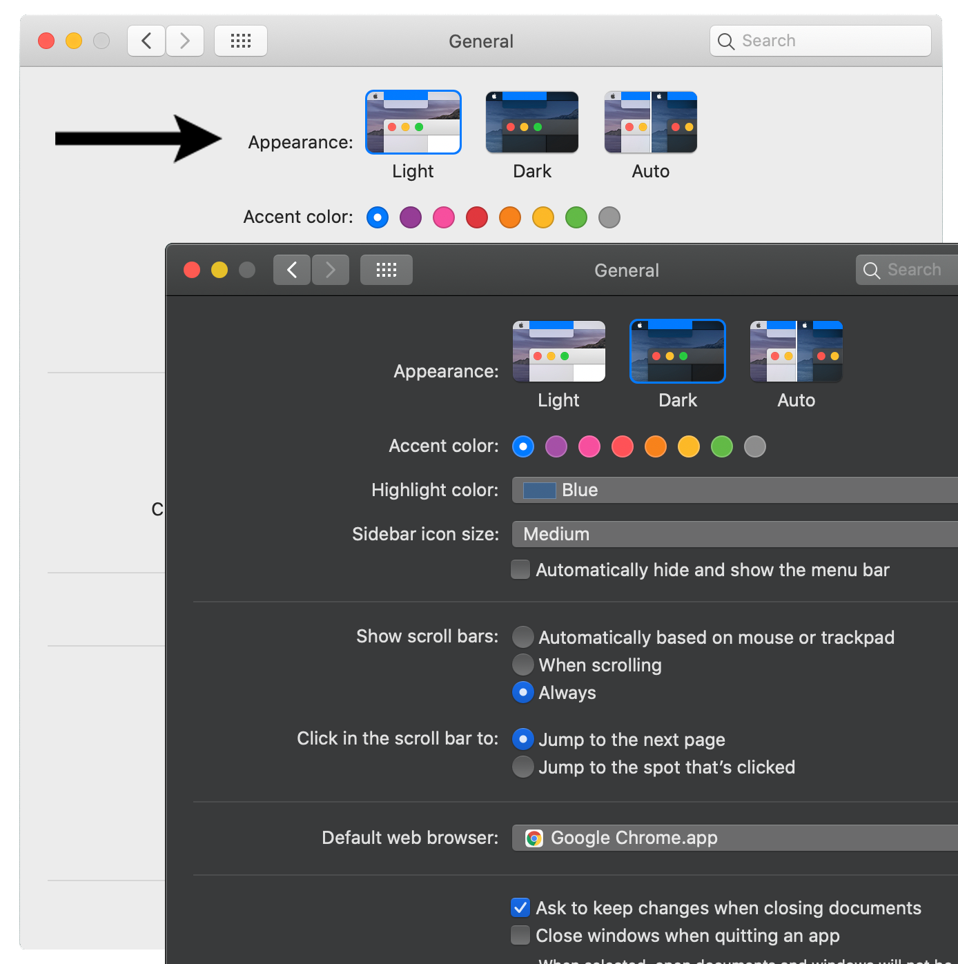
Users can enable light mode or dark mode in their device's preferences or settings, as shown below.
System Preferences > General > Appearance (light or dark)
Start > Settings > Personalization > Colors > Choose your color (light or dark).
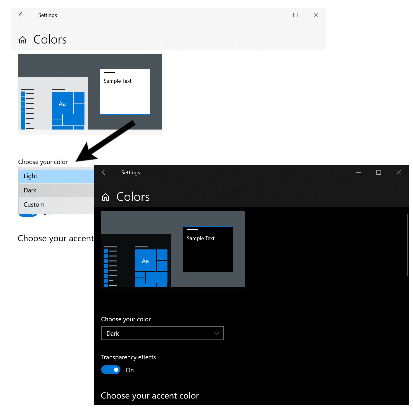
NOTE: In order for the changes to take effect on Edge for Windows, you need to tell the browser's default theme to use the "system default". (Edge: Settings and more (Alt+F) > Settings > Appearance > Default theme > System default).
Web developers need to create pages that enable a new CSS media query known as prefers-color-scheme. Note the @media (prefers-color-scheme: light) and @media (prefers-color-scheme: dark) media queries in the code below.
Visit any of the other pages on this site (such as the London, England page), then change the setting from light mode to dark mode on your device to see how the page can change. The difference is illustrated below.
In this lesson, we'll learn how to create a page with a few simple changes between dark and light. An example of what we'll create can be seen at: drsteveanderson.com/prefers-color-scheme.html.
Download the Images for this Lesson
images.zip
Custom Properties/Variables
The code base for this could be difficult to maintain without a smart implementation strategy. The use of "CSS custom properties" (or "variables") will help. Variables contain specific values that can be reused throughout a document. They are set using the following notation (--primary-color: red;) and are accessed with the var()function. See how variables are used in the CSS code below.
HTML
<div class="container">
<div class="item1">
<h2>London, England</h2>
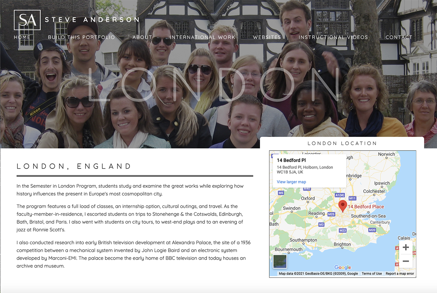
<p>In the Semester in London Program, students study and examine the great works while exploring how history influences the present in Europe's most cosmopolitan city.</p>
<h3>Live in the West End</h3>
<p>The city's major tourist attractions, shops, and entertainment venues are all close by.</p>
</div>
<div class="item2">
<img src="images/london-color-1.jpg">
</div>
<div class="item3">
<img src="images/london-color-2.jpg">
</div>
<div class="item4">
<h2>Broadcasting History</h2>
<p>There is a broadcasting history museum where you can learn about early British television development at Alexandra Palace.</p>
<h3>History in the Making</h3>
<p>This was the site of a 1936 competition between a mechanical system invented by John Logie Baird and an electronic system developed by Marconi-EMI. The palace become the early home of BBC television and today houses an archive and museum.</p>
</div>
</div>
CSS
@media (prefers-color-scheme: light) {
:root { /* The root selector is the same as the html element. */
--color:#333;
--background-color:#ddd;
--heading-color:#bb5555;
--item-bg:#ccc;
}
}
/* VARIABLES FOR DARK MODE */
@media (prefers-color-scheme: dark) {
:root {
--color:#eee;
--background-color:#333;
--heading-color:#ffdddd;
--item-bg:#222;
}
}
/* MAIN STYLES */
body {
color: var(--color);
background-color: var(--background-color);
box-sizing:border-box;
margin:0 auto;
font-family:Arial, Helvetica, Sans-serif;
}
h2 {
color: var(--heading-color);
text-transform: uppercase;
}
h3 {
color: var(--heading-color);
}
img {
max-width:100%;
height:auto;
}
.container {
display:grid;
grid-template-columns: 1fr 1fr;
grid-gap:12px;
margin:20px;
}
.item1 {
background-color: var(--item-bg);
grid-column: 1;
padding:4px 12px;
}
.item2 {
grid-column: 2;
}
.item3 {
grid-column: 1;
}
.item4 {
background-color: var(--item-bg);
grid-column: 2;
padding:4px 12px;
}
Note: Besides the values "dark" and "light", an earlier version of the spec included a third value, "no-preference". It was meant to indicate that the user has made no preference known to the system. Since no operating system or browser ever implemented it, the value was removed.
See the "Accessibility" section of http://css-tricks.com/a-complete-guide-to-css-media-queries for more preference media features.
Contact Form with CAPTCHA
The contact form on this site is located at the bottom of each page..
In this lesson, we'll learn how to create an HTML form where the form information is sent via email to a particular recipient or recipients. Due to concerns about spamming robots hijacking your form, we'll also add a CAPTCHA feature.
Spammers are constantly looking for exploitable web forms. At best, an unprotected form will simply mean your own spam will increase. At worst, the spammers can alter your email headers to send bulk unsolicited emails (known as "email injection") from your hosting account to thousands of others. This may result in a warning from your hosting company and they could even ban your site.
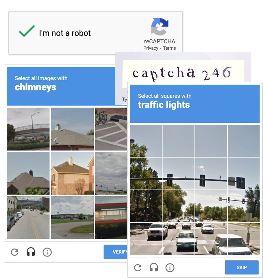 To avoid these problems, you'll want to enable form validation via CAPTCHA. CAPTCHA stands for Completely Automated Public Touring test to tell Computers and Humans Apart." The system requires that someone take some action, such as clicking a "I'm not a robot" checkbox, or correctly evaluating a sequence of letters or numbers contained within a distorted image. Another system has a user identify the areas of an image that contains certain objects (such as traffic lights). The form information will be sent only if the correct choices are made.
An even newer version (version 3) works transparently for website visitors. There are no challenges to solve. Instead, it continuously monitors the visitor’s behavior to determine whether it’s a human or a robot. Web developers need to decide which action to take depending on the score. Getting this configuration right is difficult for even the most experienced web developer. (Source)
Setting Up reCAPTCHA
Google provides a free CAPTCHA integration service known as reCAPTCHA. To set it up, simply login to your Google account and go to: http://www.google.com/recaptcha/admin. From there, you will need to "Register a new site."
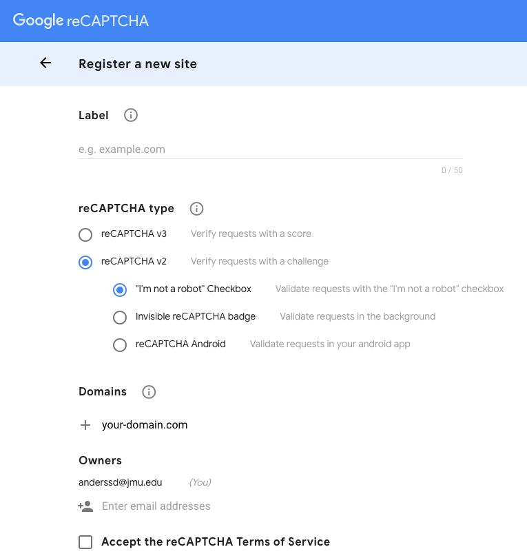
Google reCAPTCHA Screen One
On this screen, you can give your site a label. It's not important what you call it. This is only for distinguishing from among multiple sites. Give it a name that makes sense. You can choose as "reCAPTCHA type" the option reCAPTCHA v2. You can use the option "I'm not a robot" Checkbox. (Feel free to change these options and experiment later). Under "Domains", enter the domain name for the site you want to add reCAPTCHA to. The owner will be the email address you logged into Google with. Hit the submit button and it will take you to the next screen.
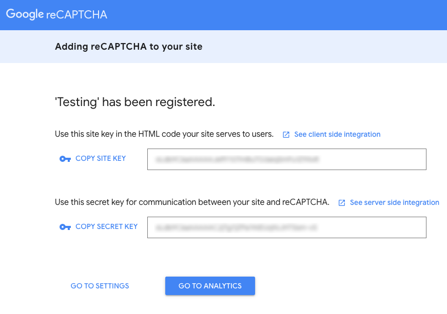
Google reCAPTCHA Screen Two
This page lists both your "SITE KEY" (aka public key) and your "SECRET KEY" (aka private key). I have blurred my keys so that the secret key won't be known to others. You'll need this information when you start coding.
Using PHP
Creating the HTML form is simple. Making the form send the data via email could be simple as well as long as the form action uses what's called a "mailto" action, as shown below.
<form action="mailto:[email protected]" method="POST">
The problem with using the "mailto" action is that once a user clicks on the submit button, they need to have their device set up to launch their email client application in order to send the form data. If the user has not done that or perhaps they are using someone else's device, the approach won't work.
To solve this problem, we'll use PHP to send the form data. PHP is a server-side scripting language meaning that in order for it to work, the PHP file (ending in .php) needs to be on a web server online. The submitted form data goes first to the PHP file which then formats it and sends it to the intended recipient (or recipients) as email. It can also work in conjunction with a MySQL database to store the data online.
NOTE: PHP stands for "PHP Hypertext Processor." It is what's called a recursive acronym in that the acronym refers to itself.
Using PHP will require a different form action, as shown below.
<form action="formsubmit.php" method="POST">
Notice that instead of using "mailto", the form action now forwards the form data to another file we've called formsubmit.php.
The diagram below shows how the process works. First, the user fills out the form (form.html) and hits submit. Next, the data from the form is passed along to a PHP file called formsubmit.php. Finally, the PHP file uses a built-in mail function to send the data via email to the specified recipient and it arrives in their in-box.
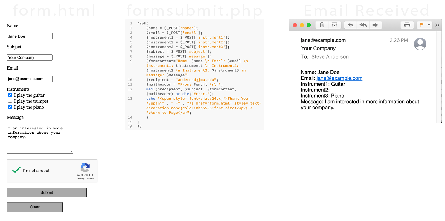
As you go through this lesson, remember that your HTML file and PHP file will need to be online to make the form work. All hosting companies (such as ionos.com or godaddy.com) should now make PHP available. Simply create form.html and formsubmit.php then upload them to your hosting account using an FTP application such as FileZilla.
We will create a basic form with reCAPTCHA like this one drsteveanderson.com/form.html
HTML
<script src='https://www.google.com/recaptcha/api.js'></script>
<!-- PLACE BETWEEN THE <body> AND </body> TAGS -->
<form action="formsubmit.php" method="POST"> <!-- Sends data to formsubmit.php -->
<p>Name</p>
<input type="text" name="name">
<p>Subject</p>
<input type="text" name="subject">
<p>Email</p>
<input type="text" name="email">
<p>Instruments<br>
<input type="checkbox" id="instrument1" name="instrument1" value="Guitar">
<label for="instrument1"> I play the guitar</label><br>
<input type="checkbox" id="instrument2" name="instrument2" value="Trumpet"">
<label for="instrument2"> I play the trumpet</label><br>
<input type="checkbox" id="instrument3" name="instrument3" value="Piano">
<label for="instrument3"> I play the piano</label>
</p>
<p>Message</p>
<textarea name="message" rows="6" cols="25"></textarea></p>
<p><div class="g-recaptcha" data-sitekey="YOUR-SITE-KEY-GOES-HERE"></div></p> <!-- Places CAPTCHA on screen. Put in your site key -->
<p><input type="submit" value="Submit" style="background-color:#aaa; width:20em; height:2.5em;"></p>
<p><input type="reset" value="Clear" style="background-color:#aaa; width:14em; height:2.5em;"></p>
</form>
PHP
FILENAME: formsubmit.php
if ($_SERVER['REQUEST_METHOD'] == 'POST') {
function post_captcha($user_response) {
$fields_string = '';
$fields = array(
'secret' => 'YOUR_SECRET-KEY-GOES-HERE',
'response' => $user_response
);
foreach($fields as $key=>$value)
$fields_string .= $key . '=' . $value . '&';
$fields_string = rtrim($fields_string, '&');
$ch = curl_init();
curl_setopt($ch, CURLOPT_URL, 'https://www.google.com/recaptcha/api/siteverify');
curl_setopt($ch, CURLOPT_POST, count($fields));
curl_setopt($ch, CURLOPT_POSTFIELDS, $fields_string);
curl_setopt($ch, CURLOPT_RETURNTRANSFER, True);
$result = curl_exec($ch);
curl_close($ch);
return json_decode($result, true);
}
// Call the function post_captcha
$res = post_captcha($_POST['g-recaptcha-response']);
if (!$res['success']) {
// What happens when the CAPTCHA wasn't checked
echo '<p>Please go back and make sure you check the security CAPTCHA box.</p><br>';
} else {
// If CAPTCHA is successfully completed...
$name = $_POST['name'];
$email = $_POST['email'];
$instrument1 = $_POST['instrument1'];
$instrument2 = $_POST['instrument2'];
$instrument3 = $_POST['instrument3'];
$subject = $_POST['subject'];
$message = $_POST['message'];
$formcontent="Name: $name \n Email: $email \n Instrument1: $instrument1 \n Instrument2: $instrument2 \n Instrument3: $instrument3 \n Message: $message";
$recipient = "YOUR-EMAIL-ADDRESS-GOES-HERE";
$mailheader = "From: $email \r\n";
mail($recipient, $subject, $formcontent, $mailheader) or die("Error!");
echo "<span style='font-size:24px;'>Thank You!" . " -" . "<a href='form.html' style='text-decoration:none;color:#bb5555;font-size:24px;'> Return to Page</a>";
}
}
?>
Hiding Email Addresses
Another spam issue you'll want to consider is the harvesting of your email address that appears with your contact information. Most people will want to provide an email address as another way for people to get in touch with them. Email harvesting robots are constantly searching the web for valid addresses. If you leave yours unprotected, you'll end up with a significant amount of new spam.
There are a number of ways to protect this information from spam bots. Options include putting your email address into an image, replacing the address with a PHP script, or using HTML character entities. We'll focus on the latter two.
Option 1: Replace Email Address with PHP Script
Instead of displaying your email address on the page, you simply provide a link to a PHP script that then loads the mailto for the address. Spam bots won’t be able to see the email address and if you ever need to change the email address, you'll only need to change it in the one PHP file.
You can see how it works at: drsteveanderson.com/email-hiding.html. Notice that even if you "View Source" on the page in your browser, the email address doesn't show up. You can't see it and neither can the spam bots.
HTML
<div><p>Please <a href="mailhandler.php">email me</a>.</p></div>PHP
<?php
/* Mailhandler for the main email address */
header ("Location: mailto:[email protected]");
exit();
?>
Option 2: HTML Character Entities
With this method you'll change your ASCII email address into its equivalent decimal entity. You are essentially just encoding the characters of your email adress through the use of what are called "HTML character entities." (See https://www.w3schools.com/html/html_entities.asp). In this situation the ASCII character @ becomes @. The ASCII character for the lower-case letter a becomes a.
The characters of the email address [email protected] become...
person@example.com
Luckily, you don't have to look up all those substitutions yourself. Here's a website that will do it for you: http://wbwip.com/wbw/emailencoder.html. Just enter the text you want to convert, hit the encode button, and it will give you the HTML character entities you need.
Below is how you would make the email address [email protected] into a mailto link using HTML character entities.
HTML
Contact me at:<a href="mailto:person@example.com">person@example.com</a>.
Although it looks funny, it will look correct in the browser and will work fine in the client email application.
Using HTML character entities isn't as good a solution. Unfortunately, spam bots have gotten wise to this work-around and can automate the replacements.
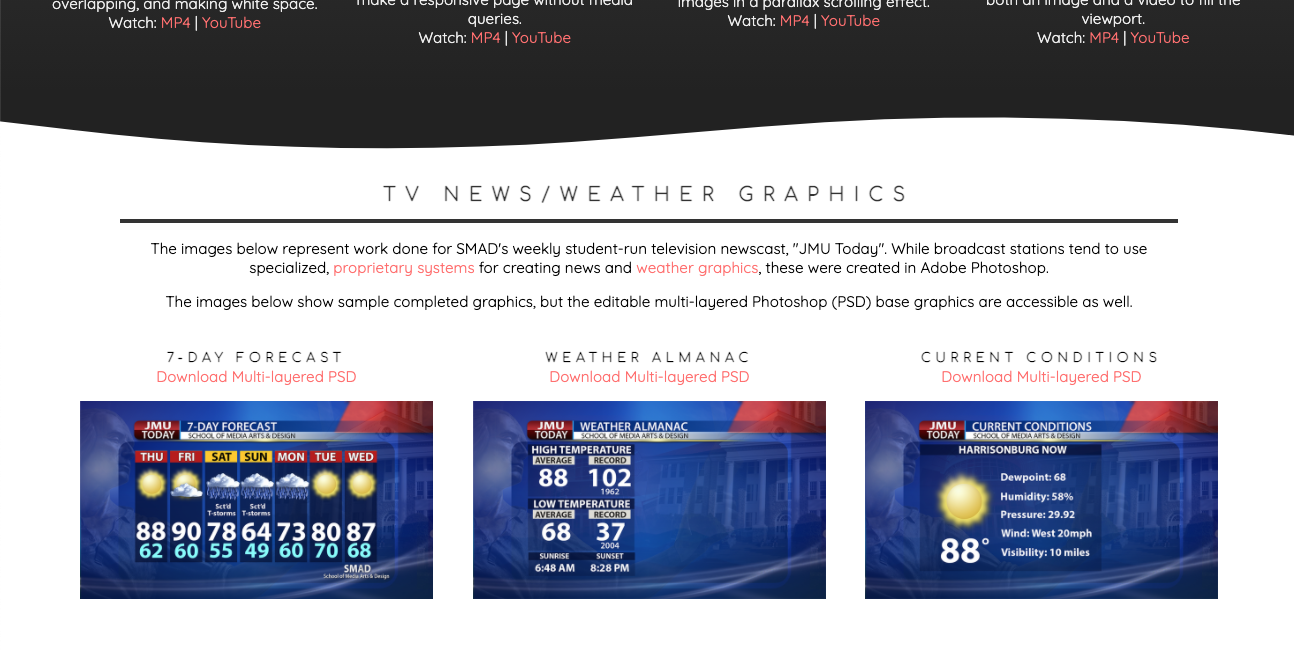
Video Playlist
In this lesson, we'll make a video playlist where YouTube videos are embedded into the page. "Embedding" means that the video will play right on the page instead of being linked and taking us off the page. Note: Besides using YouTube, this can also be done with other streaming services such as Vimeo. Or, it can be done with video files (such as .mp4 files) that are uploaded to your own hosting account.
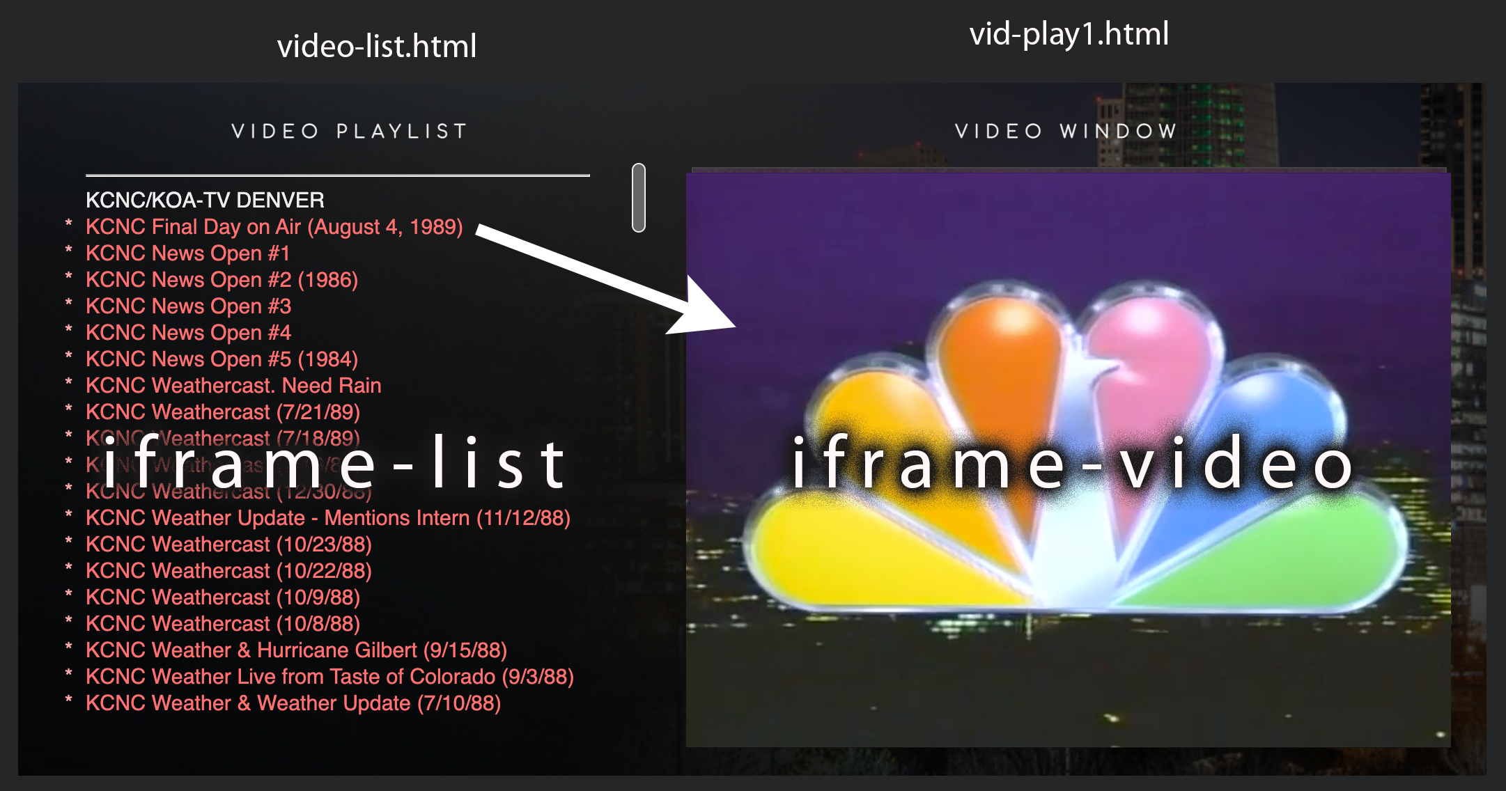
We will create a playlist of six videos. The list of videos will appear on the left side of the screen in what's called an iFrame. An iFrame essentially allows you to put a web page (or pages) within another web page. The iFrame window can bet set to a particular size, thus allowing users to scroll up and down to see the whole list of videos. The videos will play in a second iFrame on the right side of the screen.
How it Works
In this example, the page video-playlist.html creates the layout with two iFrames. Shown below, they are labelled iframe-list and iframe-video. The page loads another html file into the iframe-list section called video-list.html. It also loads an image, tvnews.jpg, into the iframe-video section.
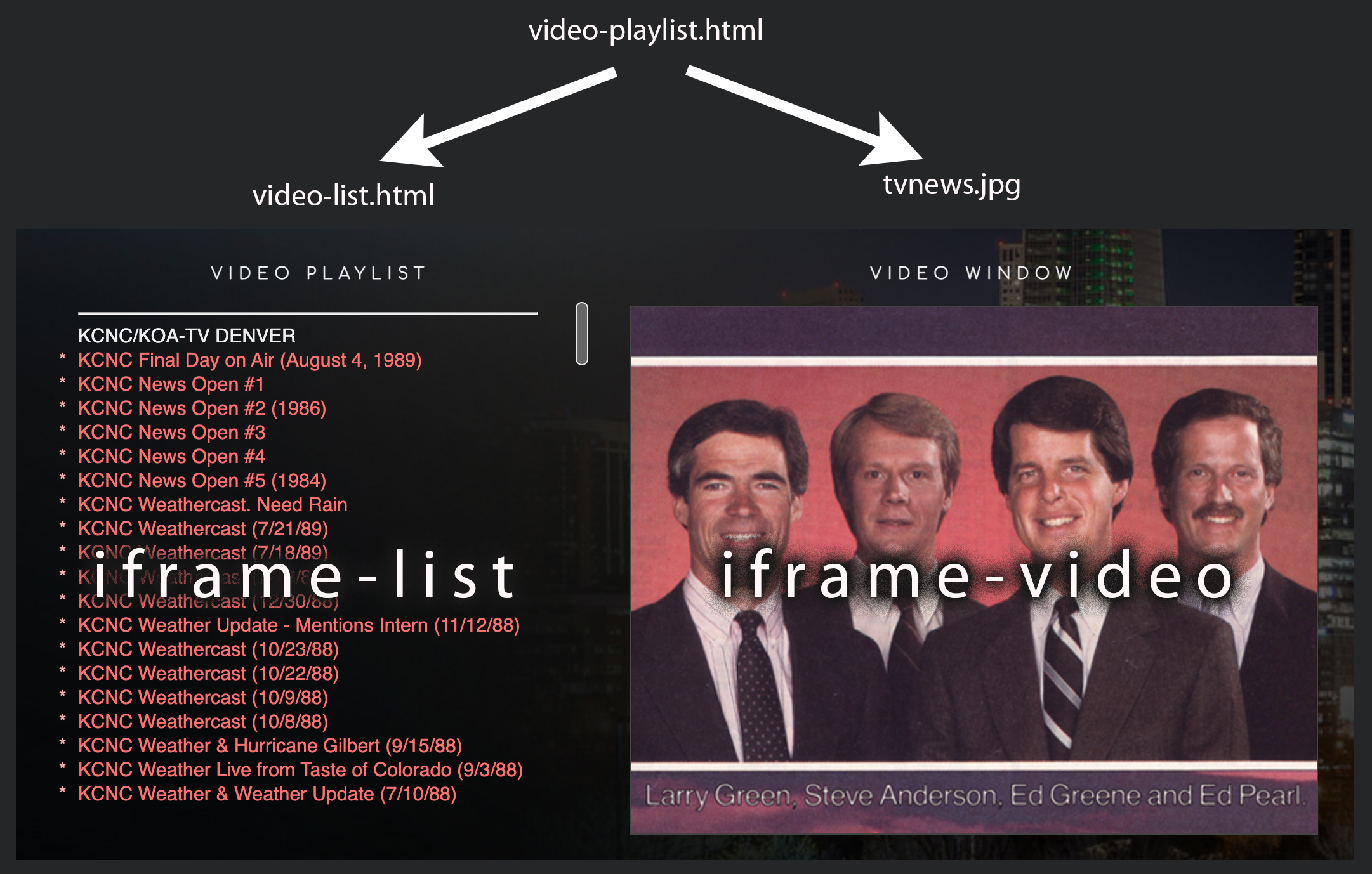
When the user clicks on one of the items in the iframe-list, it loads another HTML file (in this case vid-play1.html) into iframe-video. This HTML file contains the embed code to play the first YouTube video.
You can see what we'll be creating at: drsteveanderson.com/video-playlist.html
STEP 1The image that appears under the "Video Window" is called tvnews.jpg. You can download it here, then put it into your images folder so it can work on the page we are about to create.
Next, we're going to have to acquire the embed code for each YouTube video. Follow these steps.
Go to your YouTube account where you have uploaded some videos. Click on the Share link.
On the next screen, click on the Embed button.
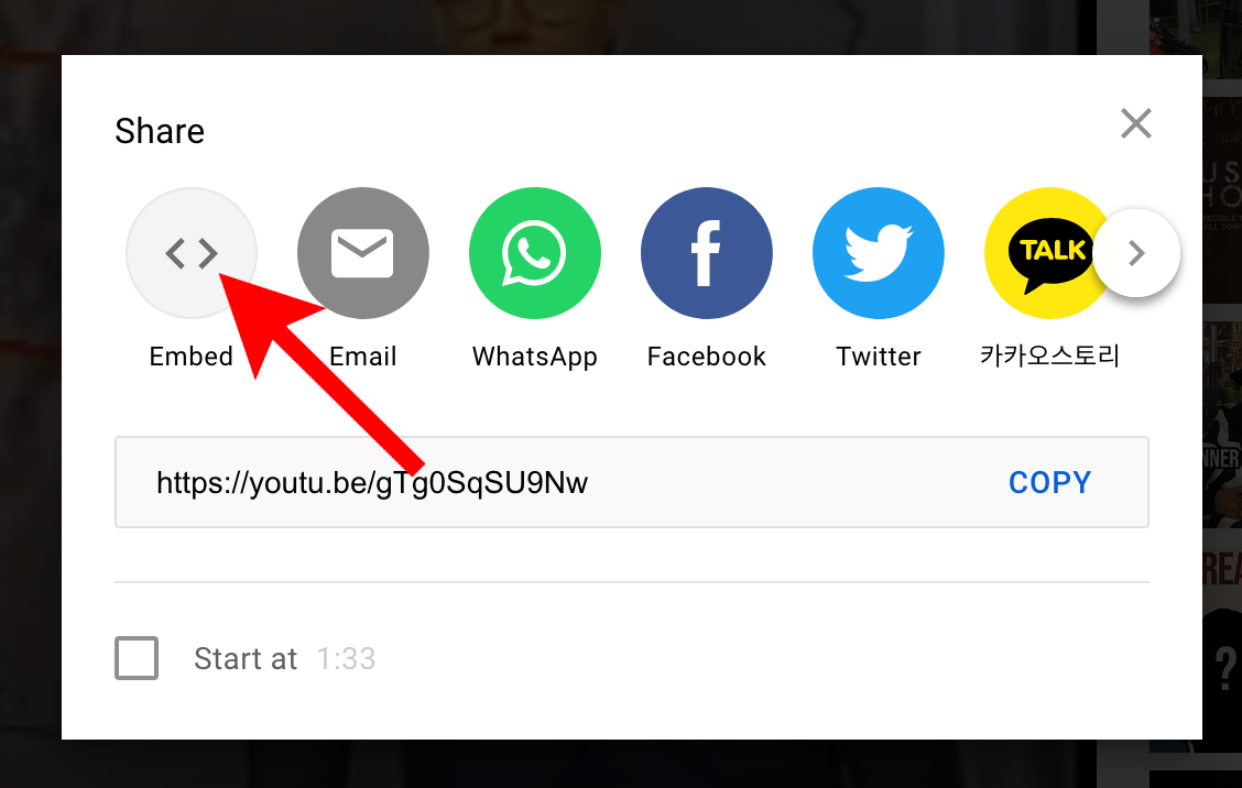
Copy the embed code it shows on the right side of the video.
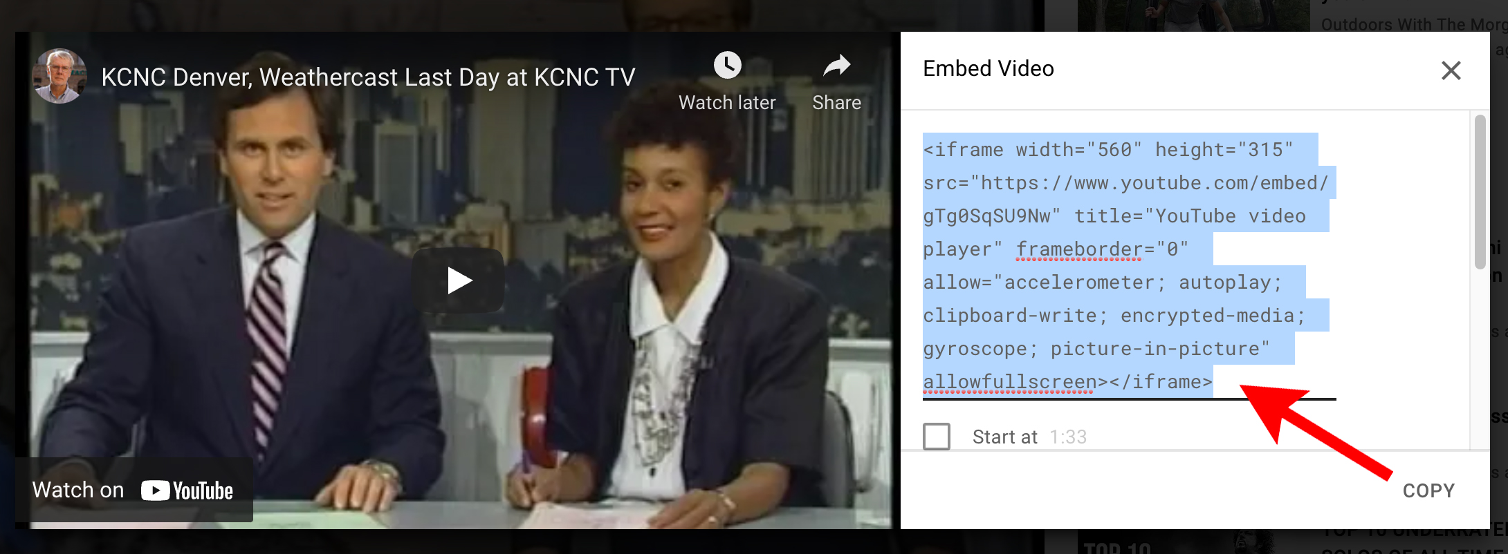
Do this for each of the videos you'll want to include in the playlist.
Next, we will need to create the following eight HTML files...
- video-playlist.html: This is the main page that contains the layout.
- video-list.html: This is the list of videos one can click on to load the selected video into the video window.
- vid-play1.html: This plays the first video in the video window.
- vid-play2.html: This plays the second video in the video window.
- vid-play3.html: This plays the third video in the video window.
- vid-play4.html: This plays the fourth video in the video window.
- vid-play5.html: This plays the fifth video in the video window.
- vid-play6.html: This plays the sixth video in the video window.
Create the HTML files below.
video-playlist.html
<div class="container">
<div>
<h3>Video Playlist</h3>
<iframe scrolling="yes" src="video-list.html" name="iframe-list" title="Iframe List" class="playlist-window"></iframe>
</div>
<div>
<h3>Video Window</h3>
<p>
<iframe scrolling="no" src="images/tvnews.jpg" name="iframe-video" height="415px" width="540" title="Iframe Video"></iframe>
</p>
</div>
</div>
.container {
display:grid;
grid-template-columns:1fr 2fr;
margin:20px 40px;
}
.playlist-window {
border:solid 1px #888;
margin-right:160px;
width:400px; /* Adjust as desired */
height:80px; /* Adjust as desired */
}
video-list.html
KCNC/KOA-TV DENVER<br>
<a href="vid-play1.html" target="iframe-video">KCNC Weathercast (August 4, 1989)</a><br>
<a href="vid-play2.html" target="iframe-video">KCNC News Open #1</a><br>
<a href="vid-play3.html" target="iframe-video">KCNC News Open #2 (1986)</a><br>
<a href="vid-play4.html" target="iframe-video">KCNC News Open #3</a><br>
<a href="vid-play5.html" target="iframe-video">KCNC News Open #4</a><br>
<a href="vid-play6.html" target="iframe-video">KCNC News Open #5 (1984)</a><br>
vid-play1.html
<!-- The width and height below are set to make your video fit the iframe. -->
<iframe width="540" height="415" src="https://www.youtube.com/embed/141eP3EO6nU?autoplay=1" title="YouTube video player" frameborder="0" allow="accelerometer; autoplay; clipboard-write; encrypted-media; gyroscope; picture-in-picture" allowfullscreen></iframe>
body {
margin:0;
}
CREATE PAGES LIKE THE ONE ABOVE FOR THE REMAINING VIDEOS.
Optional: Using .mp4 Files
Instead of uploading to YouTube or Vimeo, simply upload your .mp4 video files to your hosting account. It might be a good idea to put them into a folder called videos.
Replace the HTML code in vid-play1.html with the code below.
<source src="videos/video1.mp4"type="video/mp4">
Sorry, your browser doesn't support embedded videos.
</video>
Notice the code above includes an attribute called autoplay and an attribute called controls. If you don't want your video to autoplay, simply remove the attribute. If you don't want the video to bring up playback controls (such as play and stop), remove the "controls" attribute.
Other optional attributes include:
- loop: Specifies that the video should start at the beginning every time after finishing.
- muted: Specifies that audio should be muted when the video plays. The user can unmute as long as the controls variable is included.
- poster="URL": Specifies an image to be shown while the video downloads. If you don't use the autoplay attribute, the poster image will be shown until the user hits the play button.
Another option eliminates the need for separate HTML files to play each of the .mp4 videos. Instead of linking to an HTML file that plays the video, video-list.html links directly to the .mp4 file. Below is how the link to the first video would look.
Of course, with this method you don't have the ability to utilize attributes.
Video Backgrounds
Video backgrounds can be effective when used well. However, they can also be busy and distracting. Another big concern regards page load time. Videos are usually large files and can take a long time to load on a site potentially slowing down the rest of the content on your page.
Video backgrounds can be visually appealing and provide a dramatic effect. In some cases, a video may do more to communicate the essence of your site than a still image or text might accomplish. 11 Coffee & Co. is a site that does this well.
The Urbino, Italy page on this site also makes use of a video background at the top of the page. This is the way most video backgrounds are done -- using it in place of a "hero image."
You can see what we'll be creating at: drsteveanderson.com/video-back.html
Download the Video for this Lesson
videos.zip
PROCESS
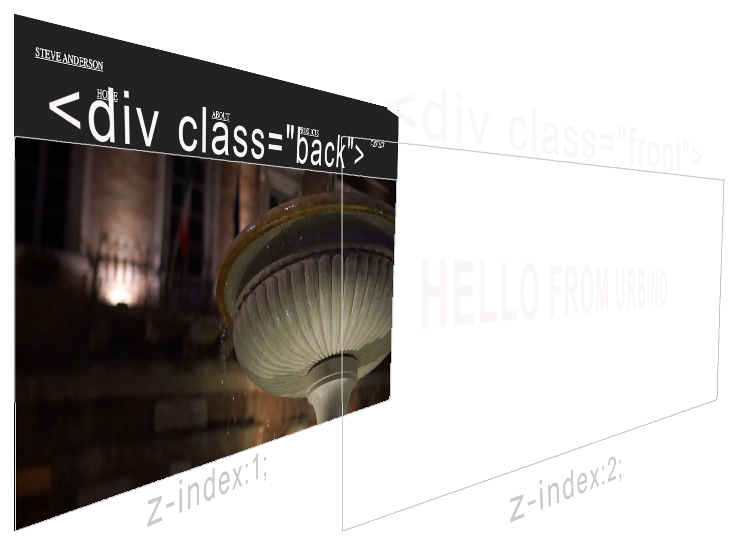
Instead of laying in the video as a true background element, we'll use the power of CSS Grid to stack one <div> on top of another <div>.
Notice that the video will be in a <div> with a class of back. We'll give it a z-index of one. Notice that the text ("HELLO FROM URBINO") will be contained in a <div> with a class of front. We'll give it a z-index of 2 to make sure it sits on top of the video.
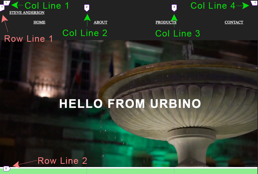
We'll place the front layer exactly on top of the back layer using CSS Grid. In this case, the container is set up to make a three column grid. Both elements will start on column line 1 and end on column line 4. And, they will start on row line 1 and end on row line 2.
Create a webpage with the code shown below.
HTML
<!-- PLACE THE FOLLOWING INSIDE THE <html> section. --><body>
<header>
<div class="logo">
<a href="#">STEVE ANDERSON</a>
</div>
<nav>
<a href="#">HOME</a>
<a href="#">ABOUT</a>
<a href="#">PRODUCTS</a>
<a href="#">CONTACT</a>
</nav>
</header>
<div class="container">
<div class="back">
<video autoplay muted loop poster="images/urbino-night-poster.jpg">
<source src="videos/urbino-night.mp4" type="video/mp4">
</video>
</div>
<div class="front">
<h1>HELLO FROM URBINO</h1>
</div>
<section>
<p>First text goes in this area. Text goes in this area. Text goes in this area. Text goes in this area. Text goes in this area. Text goes in this area. Text goes in this area. Text goes in this area. Text goes in this area. Text goes in this area. Text goes in this area. Text goes in this area. </p> </section>
</div>
</body>
CSS
/* PLACE THE FOLLOWING INTO THE <style> SECTION. *//* GENERAL STYLES */
body {
margin:0;
}
header {
position:fixed;
top:0;
left:0;
width:100%;
height:80px;
background-color:#222222;
padding:40px;
z-index:3;
}
.logo {
padding-bottom:20px;
}
nav {
display:flex;
justify-content:space-around;
}
a:link {
color:#ffffff;
}
a:visited {
color:#ffffff;
}
a:hover {
color:#ffffff;
}
a:active {
color:#ffffff;
}
/* VIDEO LAYOUT */
.container {
display:grid;
grid-template-columns:repeat(3, 1fr);
overflow:hidden;
}
.back {
grid-column:1/4;
grid-row:1/2;
z-index: 1;
margin-top:160px;
}
video {
object-fit: cover;
width: 100vw;
height:510px;
}
.front {
height:510px;
grid-column:1/4;
grid-row:1/2;
z-index:2;
margin-top:160px;
color:white;
font-family:arial,helvetica,sans-serif;
font-size:24px;
letter-spacing:.2rem;
display:flex;
justify-content:center;
align-items:center;
}
section {
grid-column:1/4;
padding:4px 40px;
background:lightgreen;
}
Contact
Send a Message
Contact Information
Location: James Madison University, 54 Bluestone Dr., Harrisonburg, VA 22801